

这个模型是露丝灰色,当地的女孩,我和妻子遇到作为一个服务员在一个餐馆在北卡罗来纳州。
它有时很高兴做一个较小的绘画这样的第一次,因为它允许您设计出任何问题之前。它总是容易实验和尝试不同的东西在一个草图。我也发现它更容易判断绘画作为一个整体从一个往往被小段当工作在一个更大的画布。每次我感到这发生在这幅画我拯救了这个草图,并提醒各区域如何与整个和简单和直接,我应该把各个领域。
这个过程,我也跟着在下面演示也是同样的过程我用于做这个较小的版本,只是大刷子!

这是我的初步图纸用铅笔在白色的,30“24”画布面板。如果你有麻烦,你的基本比例或绘图精一般,那么它可能是最适合你花一些时间做直在生命的图画课炭(我花了四年的生活图和我的老师比尔公园,在美国芝加哥艺术学院)。我个人使用头测量方法获取我的比例,虽然我将跳过,当在做快速草图或小画。我不能强调这一点足够,因为图纸是一切的关键。甚至超越这种一般比例大纲,你将使用你的绘画技巧与每个笔触你地方,所以有绝对的掌控这一非常机械技能就是允许你表达创造性的东西。
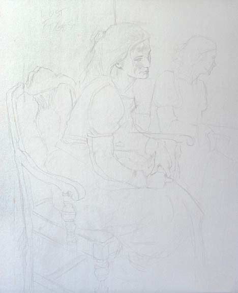
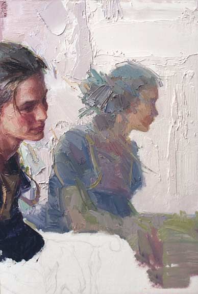
是否要在画布上画一些东西或去正确的画是一个争议很大的点。我工作两个方面我自己。对于一个简单的横向或纵向我将直接进入绘画,这使得它更容易得到不错的边缘和绘画。像这样的东西更复杂,精确的成分是必不可少的,我事先画出来。的缺点是,你会发现自己苦苦挣扎于油漆的冲动在和线条,让你的边缘和笔法遭受。的优势,当然,不是担心如果这手或脚将漂移了画布的边缘!对于每一幅画你要计这优势是更重要的。你可能会注意到,我写了“失去的边缘!“在画布的左上角一个提醒自己。有时我会写“斜视和比较”或一些其他的事情,我觉得我需要努力。
在这里我首先感兴趣的中心,脸。我也扔的一些背景,所以我有一些油漆的边沿,脸颊和额头工作边缘。
慢慢的,耐心的,我的工作从区域面积,首先阻塞在啤酒模式,然后将越来越小的模式在上面这些。如果你能第一次就把事情做对你把细节,然后你仍然可以看到底层,大胆的中风和这是什么会让你的画看起来松散和活着。这就是为什么绘画技巧是非常重要的。你必须调整你的笔法,事情会变得更混和在一起时(至少对我的口味)。试着和计划你的笔刷像吝啬鬼;更少的你可以做到,你的画看起来将更加强大。如果你感到困惑,觉得画鼻子。你会想要画阴影之下在一个大的鼻子,简单的一笔,然后使用一对他人漆在黑暗的鼻孔。另一方面,如果你画的小形状的鼻孔第一,你就得使用大量小挑剔的笔触来填入阴影区域周围的黑暗。再次,总是做较大的形状第一,尽可能用最少的杆数,那么小的!

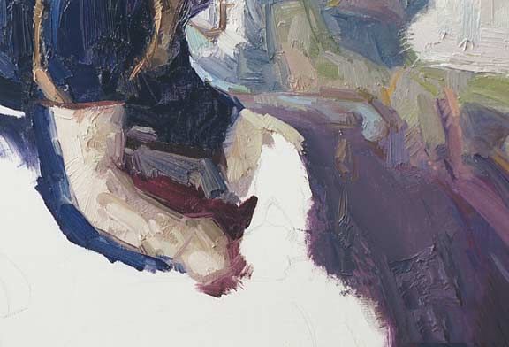
下面是几个特写镜头的脸。因为光源的这幅画是一个北窗,灯光和阴影相对凉爽温暖。如果我是使用一个聚光灯,这些温度将被逆转。有一件事要记住的是,光源的色温是混合与当地的颜色对象本身。因此,光一边的脸只是酷与影子的脸,虽然这两种颜色的可能技术上温暖的颜色光谱。这也是真正的蓝色的衬衫和红色的裙子,我用蓝色的阴影和光线的衬衫,但我使用冷却器为蓝色的光明和温暖的蓝色阴影面。只有当一个对象是白色的,你会看到一个完全相反的颜色的光线和阴影,因为对于白色,它没有地方色彩影响颜色的光击中它。
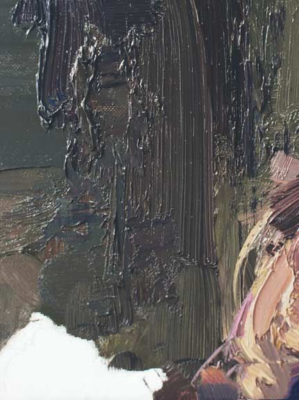
这里有一些细节在后台的笔刷。虽然我认为是一个现实主义者,我喜欢让每一节有趣的画从一个抽象的结构或设计观点。我有时会阻挡我的绘画和小段问自己如果我陷害只是这部分将它仍然是有趣的,即使你不能告诉它是什么。如果不能,那么我有更多的工作要做。只是画一些足够精确,有人认出那是什么对我来说是不够的。
这是一个特写镜头反射在镜子里的像,我联合使用刷和调色刀工作块在光领域。
我决定保持黑暗价值观的镜面反射两个或三个值都轻创造距离和使它看起来更像一个反射,尽管它只是作为全部价值在实际场景。
只是地缓慢前行,稳步、掩盖,白色帆布!朴先生的用来喊出“不要走那么快你可以准确的!“大约十次每天,我还听到他的声音回荡在我的脑海里我每次坐下来,画架前。
这是另一个细节。我想创建一个各种各样的边缘——一些锋利,一些完全丧失,所有的品种之间。有无数的方法来做一个软边缘。你可以涂抹,刮去用调色刀,干刷,或混淆中间值和躺在黑暗与光明之间的边缘。
试着忘记你的绘画。认为事物的抽象模式相关的形状。这就是所谓的“看像一个艺术家”。我们的心灵的先入为主的观念面貌的,什么颜色的树或天空是什么阻止我们画什么我们都真的看到。我记得曾读到自闭症儿童不能被视觉错觉,因为他们的部分大脑,让事情在上下文的周围,它出现在过去没有函数“正常”。我个人认为原因之一是许多自闭症个体的艺术天才,因为这一过程的de-contextuallizing世界是什么让做一个伟大的绘画可能的和是最困难的事情之一来训练我们的“正常”的思想去做。这正是为什么节略太难为初学者。无论多么经常一个措施,这是一个巨大的努力说服大脑,脚在地上两次头部大小的距离!我记得在生活中绘图测量这种事情,把我的标记,然后,当我开始绘制的狭窄区域,无意识地使它越来越小。直到来了,帕克先生指出我最初的标志,我甚至意识到,我已经偏离他们!一旦你到达角度治疗一切为一个抽象的形状没有其他所有行李,你可以同样轻松地画任何东西。
在这里我已经大刷,洗在裙子和一些茜素深红色,一点点的蓝色,和一些矿物的精神来瘦下来一个触摸。当我把在折叠和强调,我会试着离开带来的初始起见尽可能透过。
下面是起见的椅背。我试图离开边缘介于硬和软,让我失去一些自由,然后根据需要锐化别人。

这里是最后的画下面。因为它的30“24”有点难能感受到它当它吹到这么小的尺寸,但至少这将给你一个想法的过程。
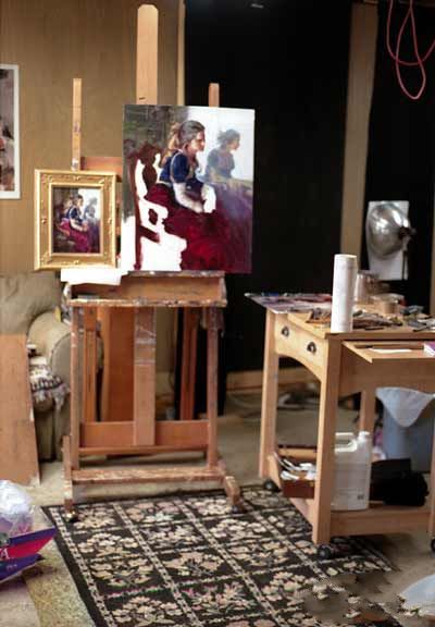
这是一杯我的画架和左边的小草图和较大的版本在进步。
原文如下:
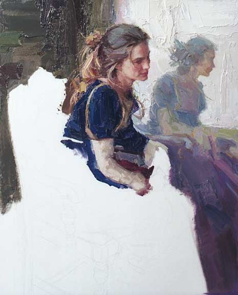
This is the original 12" by 9" painting that I wanted to do as a larger, 30" by 24" studio painting.
The model for this is Ruth Gray, a local girl who my wife and I met as a waitress in a restaurant here in North Carolina.
It's sometimes nice to do a smaller painting like this first because it allows you to work out any problems beforehand. It's always easier to experiment and try different things in a sketch. I also find it easier judging the painting as a whole since one tends getting caught up in small sections when working on a larger canvas. Every time I felt this happening during this painting I was saved by this sketch and reminded how each area related to the whole and how simply and directly I should be treating the various areas.
The process that I followed in the following demo is also essentially the same process I used in doing this smaller version, just with larger brushes!
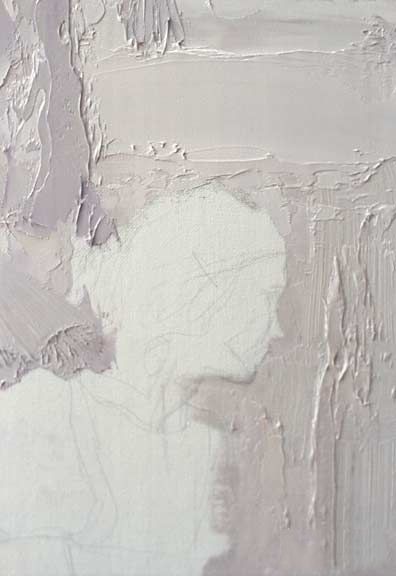
Here's my preliminary drawing in pencil on a white, 30" by 24" canvas panel. If you're having trouble with your basic proportions or drawing accuracy in general, then it is probably best for you to spend some time doing straight charcoals in a life drawing class (I took four years of life drawing with my teacher, Bill Parks, at the American Academy of Art in Chicago). I personally use the head-measuring method for getting my proportions, though I will skip that when doing quick-sketches or smaller paintings. I can't emphasize this point enough, since drawing is the key to everything. Even beyond this general proportional outline, you'll be using your drawing skills with each brush stroke you place, so having absolute mastery over this very mechanical skill is what allows you to express the creative stuff.
Whether or not to draw something out on the canvas or to go right into painting is a much debated point. I work both ways myself. For a simple portrait or landscape I will go directly into painting, which makes it much easier to get nice edges and brushwork. For something more complicated like this, where the exactness of the composition is essential, I draw it out beforehand. The drawback to this is that you will find yourself struggling with the impulse to paint within and up to the lines, making your edges and brushwork suffer. The advantage, of course, is not worrying if that hand or foot is going to drift off the edge of the canvas! For each painting you'll have to gauge which advantage is more important. You might notice that I've written "Lost Edges!" in the upper left of the canvas as a reminder to myself. Sometimes I'll write "Squint and compare" or some other thing that I feel I need to work on.
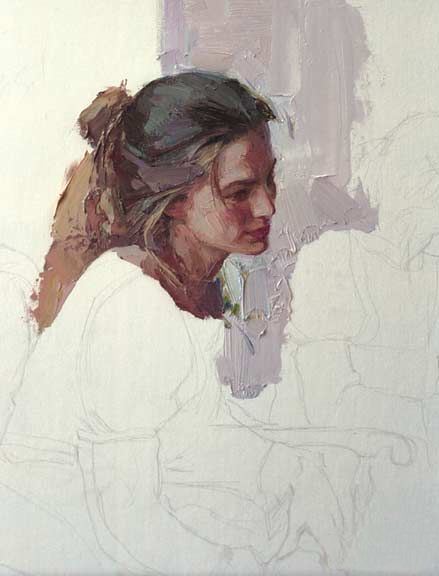
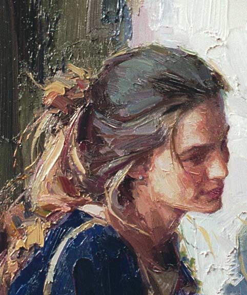
Here I'm starting with the center of interest, the face. I'm also throwing some of the background in so that I have some paint along the edge of the cheek and forehead to work the edge.
Slowly and patiently, I work from area to area, first blocking in the lager patterns and then placing the smaller and smaller patterns over the top of these. If you can get it right the first time you place the details, then you'll still be able to see the underlying, bold strokes and this is what will make your painting look loose and alive. That's why drawing skills are so important. The more you have to adjust your brushwork, the more smooshed together things will become (at least for my taste). Try and plan out your brushstrokes like Scrooge himself; the fewer you can do it in, the more powerful your painting will look. If you're confused by this, think of painting a nose. You will want to paint the shadow underneath the nose in a large, simple brushstroke; then use a couple others to paint in the dark of the nostril. If, on the other hand, you paint the smaller shape of the nostril first, you'll have to use lots of little fussy brush strokes to fill in the shadow area around the dark. Once again, always do the larger shape first in as few strokes as possible, then the smaller ones!
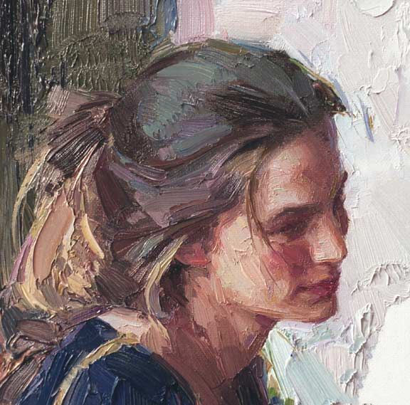
Here's a couple of close-ups of the face. Since the light source of this painting is a north window, the lights are relatively cool and the shadows warm. If I were working with a spotlight, these temperatures would be reversed. One thing to keep in mind about this is that the temperature of the light is mixed with the local color of the object itself. Therefore, the light side of the face is only cool in relation to the shadow of the face, even though both colors might be technically warm in the color spectrum. This is also true of the blue shirt and red skirt -- I'm using blue for both the shadow and light of the shirt, but I'm using a cooler blue for the light side and a warmer blue for the shadow side. It's only when an object is white that you will see a true opposite of color in the light and shadow since, in the case of white, it has no local color to affect the color of the light hitting it.
Here's some details of brushstrokes in the background. Though I'm considered a realist, I like to make every section of the painting interesting from an abstract texture or design point-of-view. I sometimes block off small sections of my painting and ask myself if I framed just this part would it still be interesting even though you can't tell what it is. If it can't, then I have some more work to do. Just painting something accurately enough for someone to recognize what it is isn't enough for me.
Here's a close-up of the reflection in the mirror as I used a combination of brush and palette knife work to block in the light areas.
I decided to keep the dark values of the mirror reflection two or three values lighter to both create distance and make it look more like a reflection, even though it was just as full value in the actual scene.
Just plodding along slowly and steadily, covering up that white canvas! Mr. Park's used to shout out "Don't go any faster than you can with accuracy!" about ten times a day and I still hear his voice echoing in my head each time I sit down in front of that easel.
Here's another detail. I'm trying to create a variety of edges -- some razor sharp, some lost completely, and all the varieties in between. There are countless ways to make a soft edge. You can smudge it, scrape it with a palette knife, dry brush, or mix up intermediate values and lay them in between a dark and light edge.
Try and forget what you're painting. Think of things as abstract patterns of interrelated shapes. This is what is meant by "seeing like an artist". Our mind's preconceived notions of what a face looks like, of what color a tree or sky is are what keeps us from painting what we all really see. I remember reading that autistic children cannot be fooled by visual illusions because the part of their brains that puts things in context to what is around it and what its seen in the past doesn't function "normally". I personally think that this is one of the reasons many autistic individuals are artistic prodigies since this very process of de-contextuallizing the world is what makes doing a great painting possible and is one of the hardest things to train our "normal" minds to do. This is precisely why foreshortening is so difficult for the beginner. No matter how often one measures, it's a monumental struggle to convince the mind that the foot in the foreground is twice the size of the head in the distance! I remember in life drawing measuring such things out, placing my marks, and then, when I started drawing the foreshortened area, unconsciously making it smaller and smaller. It wasn't until Mr. Parks came around and pointed out my initial marks that I even realized I'd been deviating from them! Once you get to the point of treating everything as an abstract shape without all the other baggage, you'll be able to paint anything with equal ease.
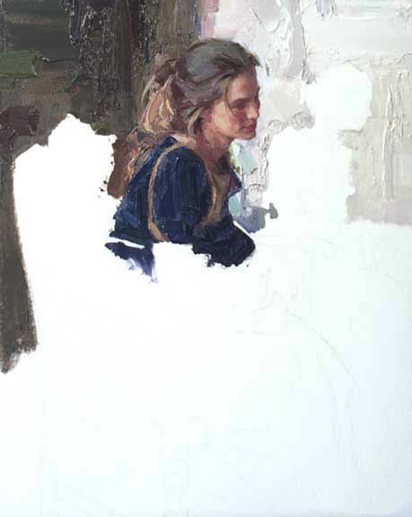
Here I've taken a large brush and washed in the skirt with some Alizarine Crimson, a bit of blue, and some mineral spirits to thin it down a touch. As I put in folds and highlights, I'll try and leave as much of this initial block-in show through as possible.
Below is the block-in of the chair back. I've tried to leave the edges halfway between hard and soft, giving me latitude to lose some and then sharpen others as needed.
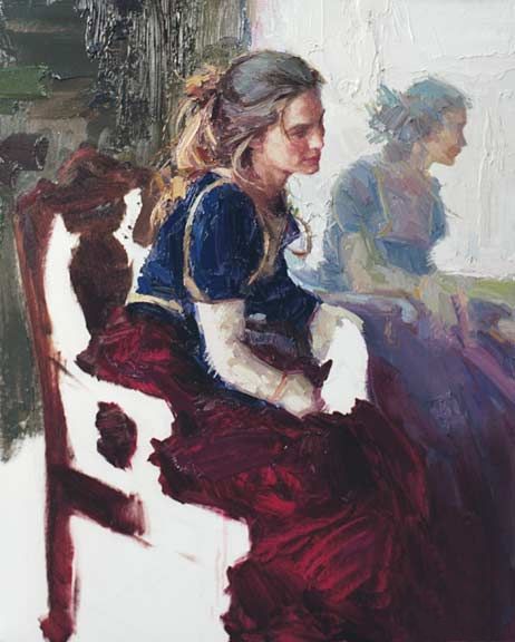
And here's the final painting below. Since it's 30" by 24" it's a little harder to get a sense of it when it's blown down to such a small size, but at least this will give you an idea of the process.
Here's a shot of my easel with the small sketch on the left and the larger version in progress.


