柔和的景观 迈克尔・切斯利・约翰逊油画演示


迈克尔·切斯利·约翰逊
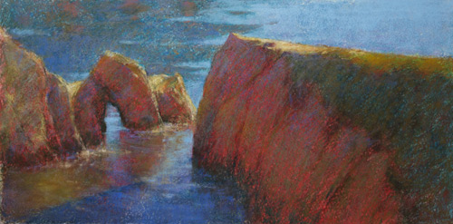
为我的工作室画点林狼崇高,我将使用几个照片,几个练习对颜色参考,空气草图和工作室油画我已经找出一些颜色的问题。我想重现的感觉不朽的岩石和凉爽的水,两个镜头温暖,但我也想要突出玩摇滚和水纹理在不同介质。
画一个简单的电网后对我的照片有好点狡猾的人,我画一个类似网格曲面上用亮蓝色彩色铅笔在准备转让设计。我用淡蓝色,因为它是一种冷色,将和其他的冷色我将使用在绘画。表面是白色的专业级沃利斯沙地的粉彩纸,11×22。
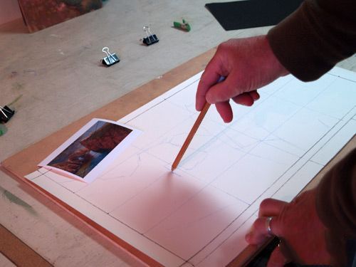
1。传输设计:使用相同的彩色铅笔,我将设计从照片到我选择的表面徒手画的。
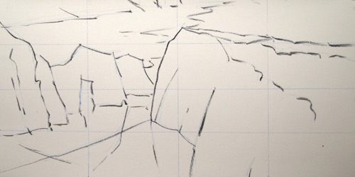
2。变黑了:现在我用一根细棍的葡萄树炭的加深轮廓。葡萄树木炭是“兼容”与柔和的,因为它是柔软的,会消失,我添加颜色。
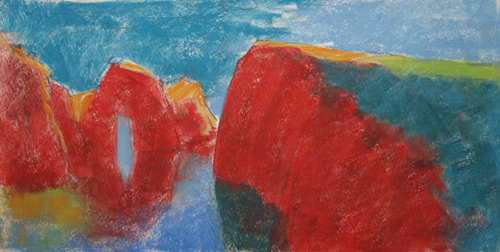
3。块的颜色:一旦最初的草图完成,我主要形状块与我的“第一最好的猜测”的颜色。对于岩石的阴影部分,我把颜色多一点向强烈,支持很酷的红色开始;后来,其中一些强烈的颜色会显示通过比较柔和的颜色,使这幅画“闪耀”。

4。灌丛和喷雾:因为我没有音调的纸在开始之前,一些白色的沃利斯纸仍显示通过,所以我使用一个大型鬃毛刷轻轻按摩到任何地区的淡白色。(他们只是小斑点,但会分心,如果他们仍然显示在最后画。)我小心删除尽可能少蜡笔。接下来,我使用一个喷雾瓶91%异丙醇,轻轻喷整个绘画。这基本上“修复”的到位。它也给了一个漂亮的、粗糙的纹理,表面将帮助建议一个岩石纹理。我也喜欢它散斑水。我更喜欢喷洒,刷牙,因为它太容易使颜色泥泞的刷。
5。酒精喷雾:这里是画在喷洒酒精。你可以斑点、粗糙的纹理喷雾创建。
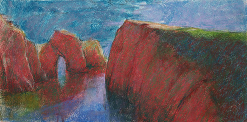
6。颜色属性的调整:在这里我做了我的专业调整颜色属性的每个形状。我已经跟踪岩石更加温和,使阴影草在右边摇滚不是那么华丽地蓝,增添温馨的阳光照射的段落,也已经开始层更多的颜色到水。水,我特别关注的区域有一个阴影在它通过正确的岩体——我想让它“读”的影子,所以我保持颜色出区域内的冷却器。体现的最左边的石头保持微妙和黑暗。另外,我加强了线的岩石——轮廓、裂缝-暗棕硬蜡笔。
7。渐淡:在这个阶段,我scumbled同样的暗棕硬柔和的阴影的岩石。这增加了品种的阴影和纹理。我已经开始深化感光前景水在阴影区域和反射。远处,顶部这幅画,我已经开始显示一行岸与一些深色和一些温暖的阳光通道指示距离。
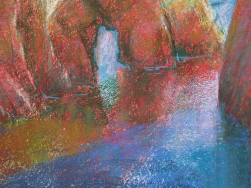
8。特写镜头:这是一个特写镜头的我在做什么在前台水。我改变颜色,住在温暖的阳光照射的通道和冷却在阴影中,所有的同时保持一个相当独特的边境,边缘的阴影。我也表示,一个淡蓝色的蜡笔,我想水打破沿底部的岩石。最后,我添加了一个建议的困难,更深的反射裂缝及岩体的影子。
9。酒精喷雾:“牙”是开始填充曲面上,所以我喷另一轮的酒精在绘画。我集中喷雾多一点直接在阴影水深化深色。我喜欢白点效果的喷雾,因为这增加了纹理和兴趣。
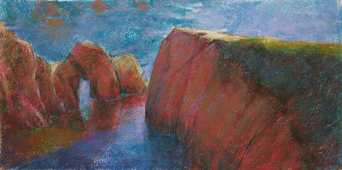
10。小的调整:我现在超越应用颜色在一个严厉的方式,因为我想让小、精致调整颜色和温度。在岩石的阴影,我使用更凉爽的绿色和一点点光灰蓝色降温红军甚至更多。我细化黑暗裂缝和添加一个黑暗、酷红的深棕色。前景中的水,我已经开始使用中风表明稍微干扰水。我在考虑怎么天空颜色是反映在两个阴影水和水在充分的阳光,同样的淡蓝色既可以用在。最后,我开始细化形状的反射在更遥远的水和添加“闪光”水满足岩有一亮,暗黄色蜡笔。
11。细化:我提炼的阴影岩石越来越玩图案的裂缝。
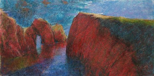
12。定型水:我玩更多的涟漪,反射。我喜欢漆水从下到上;也就是说,刷底第一(如果我能看到它),然后加入水本身的颜色,然后反射;最后,表面处理如涟漪和太阳黑子。对于这幅画,我特别感兴趣的是温暖阳光底片左下角,所以我保护它,而不是让它如此的明亮,它把眼睛掉太快从岩石。
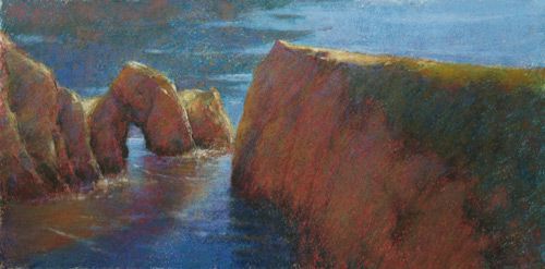
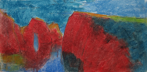
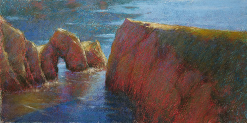
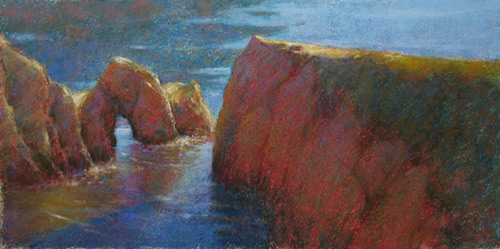
13。完成了绘画:点林狼崇高(崧,11×22)。在做这最后的照片,我觉得右边的岩石阴影仍然太红,所以我scumbled一个中值,在生赭调下来甚至更多。
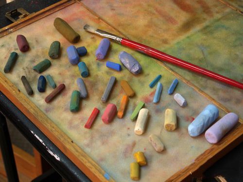
这里是所有的蜡笔我用来做这幅画——只有34个棍子!学生总是惊叹于有多少颜色您可以从如此少的棍子。
原文如下:
Point Lobos Sublime Demo
by Michael Chesley Johnson
For my studio painting Point Lobos Sublime, I will use a couple of photos, several plein air sketches for color reference, and also a studio oil painting in which I have already worked out some of the color problems. I want to recreate the feeling of the monumental rocks and the cool water, both shot with warm highlights, but I also want to play with the rock and water textures in a different medium.
After drawing a simple grid on my photograph with a fine-point Sharpie, I draw a similar grid on my surface with a light blue pastel pencil in preparation for transferring the design. I use light blue because it is a cool color that will work well with the other cool colors I’ll use in the painting. The surface is white professional grade Wallis Sanded Pastel Paper, 11×22.
1. Transfer Design: Using the same pastel pencil, I transfer the design from photo to my chosen surface freehand.
2. Darken the Outlines: Now I use a thin stick of vine charcoal to darken the outlines. The vine charcoal is “compatible” with pastel, in that it is soft and will vanish as I add color.
3. Block in Color: Once the initial sketch is complete, I block in the major shapes with my “first best guess” at the color. For the shadowed side of the rocks, I push the color a bit more toward the intense, favoring a cool red to start; later, some of this intense color will show through the more muted colors and make the painting “sparkle.”
4. Scrub and Spray: Because I didn’t tone the paper before starting, some of the white of the Wallis paper still shows through, so I use a large bristle brush to gently massage the pastel into any white areas. (They are only small spots, but would be distracting if they are still revealed in the final painting.) I take care to remove as little pastel as possible. Next, I use a spray bottle of 91% isopropyl alcohol and gently spray the entire painting. This basically “fixes” the pastel in place. It also gives a nice, rough texture to the surface which will help suggest a rocky texture. I also like the way it speckles the water. I prefer spraying to brushing since it’s too easy to make the color muddy with a brush.
5. Alcohol Spray: Here is the painting after spraying with alcohol. You can the speckled, rougher texture the spray creates.
6. Color Properties Adjustments: Here I’ve made my major adjustments to the color properties of each shape. I’ve made the shadowed rocks more muted; made the shadowed grasses on the right rock not so garishly blue; added warmth to the sunlit passages; and also have begun to layer more color onto the water. For the water, I am paying particular attention to the area that has a shadow cast over it by the right rock mass – I want to make it “read” as shadow, so I keep the colors within that area cooler. The reflections of the leftmost rocks are kept subtle and dark. Additionally, I’ve reinforced the lines of the rocks – outlines, crevices – with a dark brown hard pastel.
7. Scumble: In this stage, I’ve scumbled that same dark brown hard pastel over the shadowed rocks. This adds variety to the shadows as well as texture. I’ve begun to deepen the darks in the foreground water within the shadowed area and the reflections. In the distance, toward the top of the painting, I’ve begun to indicate a line of shore with some more darks and some warm passages to indicate sunlight in the distance.
8. Closeup: Here’s a closeup of what I’m doing in the foreground water. I vary color, staying with warms in the sunlit passages and cools in the shadows, all the while maintaining a fairly distinct border where the edge of the shadow falls. I’ve also indicated, with a light blue pastel, where I want the water to break along the base of the rocks. Finally, I’ve added a suggestion of harder, deeper reflections for the cracks and shadows from the rock mass.
9. Alcohol Spray: The “tooth” is beginning to fill on my surface, so I sprayed another round of alcohol on the painting. I concentrated the spray a bit more directly in the shadowed water to deepen the darks. I like the spotty effect of the spray, as it adds texture and interest.
10. Small Adjustments: I am now moving beyond applying color in a heavy-handed way, since I want to make small, delicate adjustments in color and temperature. In the rock shadows, I use more cool green and a bit of light grey-blue to cool off the reds even more. I refine the dark cracks and add a dark, cool red in with the dark brown. In the foreground water, I’ve begun to use strokes that indicate slightly-disturbed water. I’m thinking about how the sky color is reflected in both shadowed water and water in full sunlight; the same light blue can be used in both. Finally, I begin to refine the shape of the reflections in the more distant water and add “sparkle” to where the water meets rock with a light, dull yellow pastel.
11. Refinements: I refine the shadows of the rocks more and play with the patterning of cracks.
12. Finalize the Water: I play more with ripples and reflections. I like to paint water from bottom to top; that is, I paint the bottom first (if I can see it), then add the color of the water itself; then reflections; and finally, surface treatments such as ripples and sunspots. For this painting, I am particularly interested in the warm patch of sunlit bottom in the bottom left corner, so I make sure that I preserve it, but not make it so bright that it pulls the eye away too quickly from the rocks.
13. Finished painting: Point Lobos Sublime (pastel, 11×22). Before making this final photograph, I felt the shadowed rock on the right was still too red, so I scumbled a mid-value, raw umber over it to tone it down even more.
Here are all the pastels I used in the making of this painting – only 34 sticks! Students are always amazed at how much color you can get from so few sticks.
标签:


