由布莱恩麦克尼尔-演示
主副本挑战,布莱恩麦克尼尔
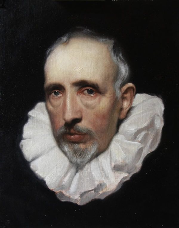
主副本一直为我快乐。我觉得我真的能够学习语言油画试图再现了这些令人惊奇的作品。与每一幅画我的证人可能词汇拓宽新的理解的材料流。我找到另一个好处是一个新副本与主人的感觉的设计。这个画家的过去,至少我尊敬的画家似乎描绘那里科目与更多的风格和活力。例如优雅的许多范戴克秀的肖像是经历的伸长身体,更普遍的注意到在颈部和手他油漆。另一方面,艺术家设计他的许多人物伦勃朗辞职和圆形粗短。在伦勃朗和他的素描自画像很多人往往相当不同于另一个。
美丽和神奇的事情是,无论哪一个肖像你看着你知道它是他的。伦勃朗的一个温馨的画面呈现在我们的联系和感觉分开。我曾经听到一个故事,他的许多隆安妮冈尼肖像看起来没有什么像保姆。这一点不是那么多得到一个照片逼真形象的人但有精华。部分人觉得和不听的眼睛。一种情绪,一个感觉像一个内存或一个梦想。我认为这就是为什么如此多的聚集到有由隆安妮冈尼肖像。他们想要转化为更深层次的东西然后了。
所以主副本的重要性是,他们为您提供信息,绘画从生活不能。有技巧和技术并不总是可见在自然因此可以得到真正的创意或回顾大师来帮助我们告诉我们的故事。他们教我们如何画唇,边缘模糊,打开我们的眼睛看到什么颜色是用来做一个白色的布料。
这个Cornelis Van Der地表古积一直是我最喜欢的因为我第一次看见它。即使在今天它仍然让我起鸡皮疙瘩的目光望着它的眼睛。每一次,我在伦敦就直接去国家美术馆看到它像我拜访一位老朋友。我从不感到厌倦。它成为一个新的绘画每次我研究它。它常常使我想放弃绘画一起当我想到这个事实,19岁的范戴克画这神奇的和复杂的头。
首先我做了一个铅笔绘图来把所有的特性,让熟悉的形状和色调关系。我发现它很有用,使这幅画第一因为整个时间,我画我成像我进攻计划。它可能看起来像一个额外的步骤,但根据我的经验,这节省了我的时间从长远来看。我已经刷手我已经画了好几次在我的脑海里工作的所有缺陷。
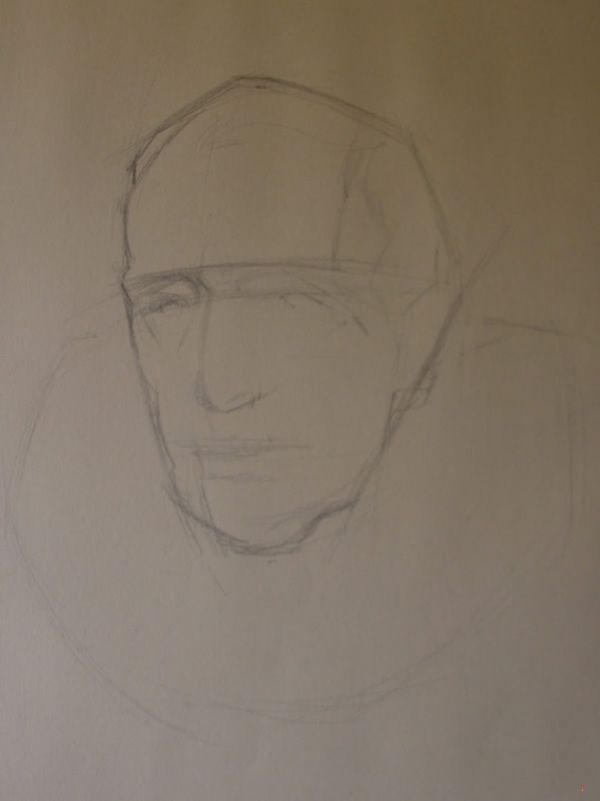
基本起见
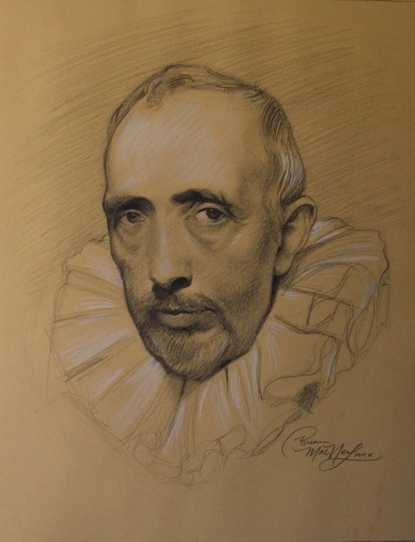
用粉笔铅笔画画加剧
我已经把图纸后,我用生赭帆布和铅白色基调和减轻绘图。我在制作地图的一种方式,我自己后来跟随与颜色。在这项研究中这是最后一次我将用生赭。
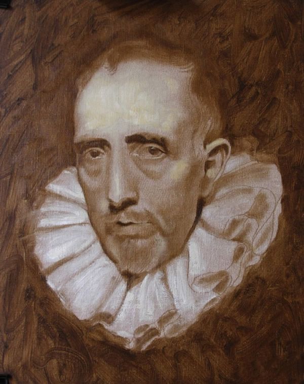
的画底色
我把这幅画干燥过夜,是经济与时间我开始在下边的头让不透明通道的白色干一段时间。我选择的颜色是局限于铅白色、黄色赭石,焚烧锡耶纳和象牙黑。还我使用太阳变粗亚麻籽油中,我被告知被两鲁本斯和范戴克。
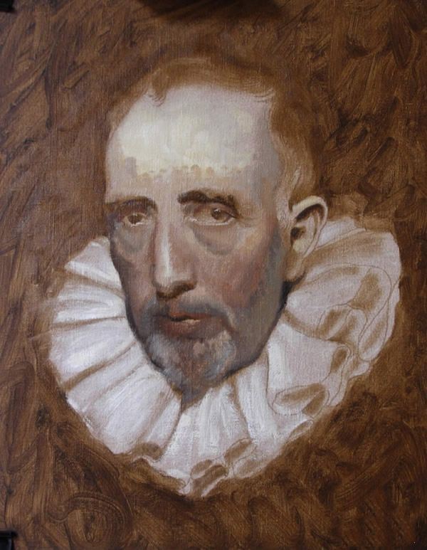
第一次实习的颜色
在这个阶段的绘画我有多数的颜色和色调放置。我将在第二天左右修复图纸和调整音调和颜色。我很小心的不去工作太增加太多颜色额在这一点上。我有键值有一些沉重的impastos轻。我这样做是因为我想额是价值和更高浓度的打火机。得到影响我将仔细让薄半透明掠过额头。建模的形式就不能最终泥浆。
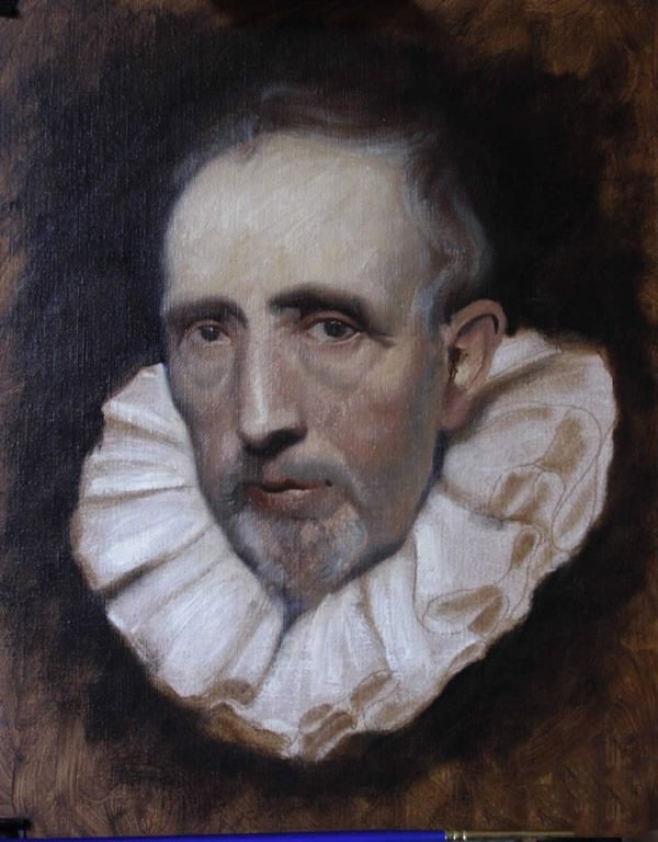
颜色和色调
更多的纠正和建模的小形式。我离开的花式刷斯托克斯直到我有足够的信心,绘图,色调和音调是相对正确的地方。
较小形态建模
现在所有的猜测工作在我身后我决定重新绘制整个头都一遍又一遍。我希望所有的中风的油漆涂在它边的一个。我也注意到肉,看上去有些沉闷和灰色。我倾向于像破碎的颜色和冷却器的肤色在绘画,但是这对我来说是缺乏统一性和生活。我重新粉刷头部和一半的衣领一天。我没碰过它因为因为其他绘画是占用我的时间。

原文如下:
Demonstration by Brian Macneil - Artist Website Artist Blog
Master Copy Challenge by Brian MacNeil
Master copies have always been a joy for me. I feel I am really able to learn the language of oil painting by trying to reproduces these amazing works. With each painting I witness may vocabulary broadening with new understanding of how the materials flow. Another benefit I’ve found with Master Copies is a new sense of design. The painters of the past, well at least the painters I look up to seem to portray there subjects with more style and vigor. For example the elegance of many Van Dyke’s portraits is experienced by the elongation of the body, more commonly noticed in the neck and hands he paints. On the other hand the artist Rembrandt designed many of his figures quit stubby and round. In Rembrandt and his many self-portraits the drawing of one is often rather different from an other.
The beautiful and amazing thing is that no matter which portrait you are looking at you know it is him. Rembrandt has a way of presenting an intimate scene were we relate and feel apart of. I once heard a story about Annigoni where a lot of his portraits didn’t look much like the sitter. The point wasn’t so much to get a photo realistic image of the persons but there essence. The part of the person that is felt and not seem by eyes. A sentiment that one feels like a memory or a dream. I believe that is why so many flocked to have there portraits done by Annigoni. They wanted to be transformed into something deeper then the way they looked.
So the importance of Master Copies is that they provide you with information that painting from life cannot. There are tricks and techniques that are not always visible in nature so one can either get real creative or look back to the masters to help us tell our stories. They teach us how to paint lips, what edges to blur, and open our eyes to see what colors are used to make a white drapery.
The Cornelis Van Der Geest has been one of my favorites since I first laid eyes on it. Even today it still gives me goose bumps looking into the gaze of it’s eyes. Every time that I am in London I go straight to the National Gallery to see it like i’m visiting an old friend. I never get tired of it. It becomes a new painting every time I study it. Often it makes me want to give up painting all together when I think about the fact that at the age of 19 Van Dyke painted this marvelous and sophisticated head.
First off i made a pencil drawing to place all the features to get familiar with the shapes and tonal relationships. I find it useful to make this drawing first because the whole time that I am drawing I am imaging my plan of attack. It may seem like an extra step but in my experience it saves me time in the long run. By the time I have brush in hand I have already painted it several times in my head working out all the kinks.
basic block-in
pencil drawing heightened with chalk
After I have transferred the drawing to canvas I use Raw Umber and Lead White to tone and lighten the drawing. I am in a way making a map for my self to follow later on with color. In this study this is the last time I will use Raw Umber.
The underpainting
I left the painting to dry over night and to be economical with time I started in at the lower portion of the head letting the opaque passages of white dry a little bit longer. The colors I have chosen are limited to just Lead White, Yellow Ocher, Burnt Siena and Ivory Black. Also I am using a Sun-Thicken linseed oil medium that I have been told was used by both Rubens and Van Dyke.
First placements of color
In this stage of the painting I have a majority of the colors and tones placed. I’ll spend the next day or so fixing the drawing and adjusting the tones and colors. I am very careful no to work too add much color to the forehead at this point. I have keyed the values lighter there with some heavy impastos. I did this because I wanted the the forehead to be of lighter value and higher chroma. To get that affect I will carefully make thin semi-opaque passes over the forehead. Modeling the forms just enough not to end up mud.
Color and tones
More correcting and modeling of small forms. The fancy brush stokes I leave out until I am confident enough that the drawing, hues and tones are relatively in the right places.
smaller forms being modeled
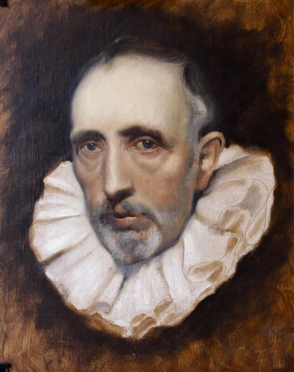
Now with all the guess work behind me I decided to repaint the entire head all over again. I wanted all of the strokes of paint to be painted into the one beside it. Also I was noticing that the flesh was looking a little dull and grey. I tend to like broken color and cooler flesh tones in paintings but this to me as it was lacking uniformity and life. I repainted the head and half the collar in a day. I haven’t touched it since because other paintings are taking up my time.
The unfinished end result
Thank you very much for viewing this work. You may check out the Pushing Pigments Blog to see other artist take on this same task.


