“画马在景观与人物”
由艾琳彭德尔顿
这幅画课将向您展示我移动从一个最初的想法,通过整个过程我画一个马主题在我的工作室。
参考图片:
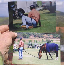
我喜欢这种坐姿的新郎,但光线和阴影模式在常务图只是让我疼到油漆他!
首先,我有一个主意。有时,来自一个照片作为这一块做的,有时它是一个想法在我的脑海里。这幅画我拍这些照片在一匹马事件附近的圣胡安Capistrano夏季2002。
和另一件关于站图他是“太大对马的高度。这是没有跳的小马,但一个巨大的温血马。摄影将这样做一个主题,一个人必须永远铭记的规模的关系。
要求格式的一个2:3比率(如24 x 36帆布),但这将是太大,船很容易显示,所以我把2:3比率降至16×24…和我碰巧有两个框架已经在这奇怪的尺寸!接下来是主食一块亚麻帆布,董事会和马克的矩形。我通常在整个表面油漆用洗油稀释,以防止“假日”(少量的画布显示通过)但就忘了。部分已经完成后,我将其缩减它挂在一个预先切开和装填板我使用1/4英寸桦木胶合板现在。大约在18美元对于一个4×8英尺表,这是合理的更多比担架酒吧!
这幅画的颜色用于是通常的调色板的五个颜色和白。我用这有限的调色板上的位置,因为我可以得到任何颜色我需要和我不是拖在大量的管子。
颜色:大红、暗绿色、群青、镉红光线和镉黄灯。,再加上白色平等我的调色板。
规划阶段:
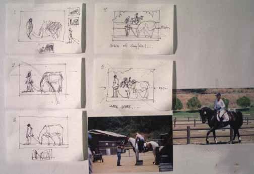
通常我不做这许多小计划,但是我想让你看看我想通过计划完成的想法,然后开始画。
上图显示了五个小草图从3 x 5随笔集。尺寸是小的,因为你可以考虑和执行一个快速草图没有太多的细节。第一个(左上)是矩形(总是显示的边缘你的工作所以你可以设计在空间)和最初的想法的新郎和马放牧。小鱼在周长小于一英寸宽,但告诉我很多关于位置和价值问题。
2号系列正在通过运动的设计加强的支持马的前腿,向后看的新郎。有一个“X”开始出现,这是强烈的抽象的构成件。它是关于设计。
数字3是排序的位置数据在地上,开始担心视线高度线(又名horison线)和也的问题,周围的空间大小的数据。
# 4解决了这个问题的放置树的形状,然后头脑风暴的一个想法添加些东西给新郎要在一个女孩在一匹马也许吗?
然后我开始看我的其他照片从那天(灯是一样的,并且方向相同),提出了两种可能的原因,他是看着他的肩膀。我决定加与平托和她的derrierre将是一个伟大的、幽默的事情让他看看!和标题来找我然后,“每个人都有自己”。
所以第五素描奠定在视线高度线(也称为一个地平线)和位置的马和骑马的人。
开始在画布上:
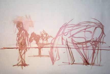
我正到画布上,现在。在这里你看到第一个图放在只有手势。任何细节!这就是所有我做在开始之前。
位置对我的工作如此重要,但之间的连接对象,该声明的故事在绘画,主要的图形处理都是我关心在这一点上。
你可以看到重要的视线高度线,因为它是低在这幅画。然而马匹在规模对方,因为如果你要画一条线穿过霍克斯的这些家伙,你会看到他们都是在同一个平面上。观众是在眼睛水平的新郎的背后,这是非常有意的。
这幅画开始的第一个应用程序的颜色:

我总是试图让大形状和重要物品放在第一,故事这匹马和他的大运动与冷却器,新郎的头,马和骑手身后。
你也可以看到我身后的树上画的图和马,恭维他们的位置,而不是与它竞争。没有树,现在,就给我一个“感觉”,在那里他们要。这些树是位球员和只会提供一个配角。
什么是最重要的在这一点上是倾斜的运动,马放牧,向后看新郎的和他跨步位置,中期背后马和骑手。
我总是先从薄暗,亚麻帆布(这是掌握石膏)只是豪华与薄漆!这样的感觉…
阴影下的数据也作为线,因为这是黑暗模式值,加强布局。
继续:
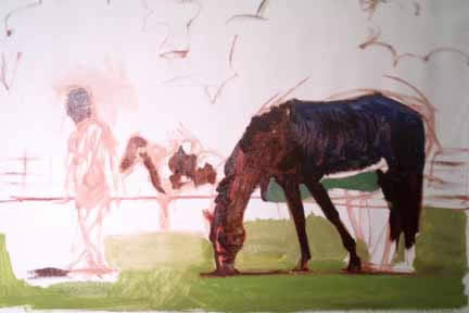
现在是时候开始阻塞在中间值,并得到该帆布覆盖,并开始把一些细节到中央数据。我已经看到一些需要改变一些关系的大小,这是容易凿出的背景和油漆使这些变化…你会看到在一段时间。
在这里,你可以看到我在草地上塞风靡马的前腿,涂蓝色的冷却器的画底色为亮点来之后。我混合的颜色,就是阴影凉爽,画它,太。我添加了一些粗略的将略高于视线高度也行。
所有的这幅画你看到需要大约15分钟。
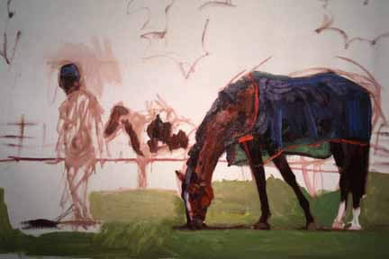
上面的图片,你会发现我已经从草地到马,支出约20分钟要从大的形状我放在第一,较小的形状,定义和显示差异在这些大的形状。
进一步解释,马是由两个主要形状的黑红色形状,这是一个混合的alizerin和暗绿色,感动与温暖,cad红色和蓝色冷却器形状,由深蓝色和一些alizerin在较低的一边。现在我的过程是去和厚躺在较小的形状给表格马和冷却器。这是做了一个最小化,和一个刷痕的形状。我把蓝色/白色轻形状来定义的褶皱冷却器,紫色/白色形状来定义顶部两侧,光经过反射和马的隐藏,然后把那cad红灯并把它和一些aliz。和蓝色让颈部高光和面部形状的马。
我添加了紫白色的火焰,然而在画布上仍显示通过鼻子和腿的背面白色区域。在不久的前腿,我使用了背景绿色定义线的腿和下活着,这只是一个灰色马克用刷子和需要进一步精炼。
你怎么阻止去太多的细节吗?我的回答是斜视很多,和停止寻找细节。眯着眼看给你一个“分层的边缘”显示你哪些是重要的在你的源材料,哪些可以扔掉。
背面的骑士,我也开始工作,将形状的平托从深色的部分,和躺在光中值上的影子的马。
记住,我的工作通常从黑暗到光明,躺在一个黑暗的抽象基础水泥在设计作品的。一切都是服从,设计,这就是为什么(大多数)我画的是愉快的看和有趣的生活。我不断重申,它是所有关于设计。
细节的马的冷却器:
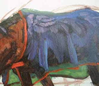
这是一个封闭的第二层油漆在冷却器。
如果你记得,我说马基本上是两个形状,你会发现所有的蓝色和蓝紫色上完成这两个形状。
看看closeure冷却器的在脖子上。看到一个笔,表现了闭合装置吗?(魔术贴)一个刷痕。决定性的。我将做一些“边缘失去“稍后,但这是“大局”的那些标志着下去。
我坚信我的工作不仅仅是对象和他们的故事(马,新郎,骑士),但同样重要的是数量和感觉的brushmarks。“绘画”绘画…
覆盖在画布上:
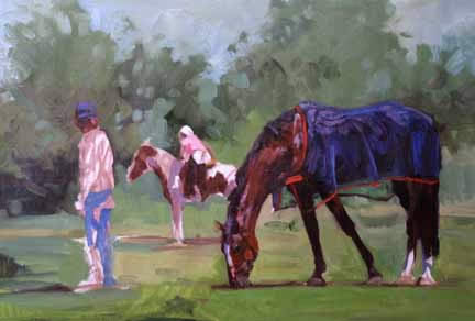
我迅速地覆盖在画布上从上到下的背景。我把在遥远的树木,使他们既温暖的镉在左边,和蓝绿色在其他地方,和打火机上当然!我用我的手指在地方混合叶子形状向天空,这是一个灰色的蓝色和白色的组合与其余的调色板混乱混合在保持和谐去。我画树第一,然后天空,浸渍和跳跃的刷子来回往返于两个领域。
注意,在加坐马,我犯了一个更有趣的模式的标志。在背上,其余的树木少,不那么有趣的明暗差别强烈的。我想要你,观众,看那夫人坐马,两边有前景的马和新郎。如果我做了所有这些树有趣,级别,你会徘徊…不太好。
我也做了一些工作的头、肩和冷却器,前腿和蹄。

这说明我是如何制作背景更有趣,开始认真工作在遥远的平托和骑手。
新郎有一些严重的比例问题,我没有他的形状和大小的阴谋,相对于其它绘画,所以我必须拿出部分来解决这个问题。
他太长在躯干,所以我只是把我的手指和推动,把多余的油漆,在纸巾擦了擦。现在我保护我的手用护肤霜(手套棚,无形的洗手液,手套像但不透水的溶剂和色素污染。在你的硬件存储。)
绘画的尾部在正确的地方也允许我重塑他的一些臂和衬衫,它击中的裤子。我还做过他的脚,他的头骨再次出现。
然后我画在他的衬衫,给了他一个小小的啤酒肚,用暗色调(总是黑暗的alizerin深红色和绿色颜料和/或深蓝色)。
我做的改变颜色的东西即使我使用我自己的源材料。如果它能让设计更好,它会改变…
这个是完成的绘画。
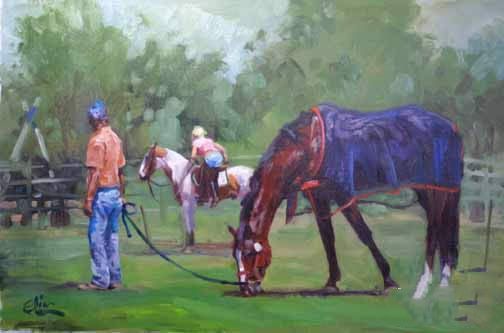
原文如下:
“Painting Horses in Landscape with Figures”
By Elin Pendleton
This painting lesson will show you how I move from an original idea, through the entire process as I paint an equine subject in my studio.
The reference photographs:
I liked the sitting position of the groom, but the light and shadow pattern on the standing figure just made me ache to paint him!
First off, I get an idea. Sometimes that comes from a photograph as this piece did, sometimes it comes as an idea in my head. For this painting I took these photographs at a horse event near San Juan Capistrano in the summertime of 2002.
And another thing about the standing figure–he was ‘way too large against the horse’s height. This was no jumping pony, but a huge warmblood. Photography will do that to a subject, and one must always be mindful of the relationships of scale.
The format required a 2:3 ratio (such as a 24 x 36 canvas) but that would be too large to ship easily to shows, so I took the 2:3 ratio down to 16 x 24…and I happen to have two frames already made up in this odd size! Next was to staple a piece of linen canvas to a board and mark out the rectangle. Usually I paint over the entire surface with a wash of oil thinned down, to prevent “holidays” (bits of canvas showing through) but just forgot. After the piece is done, I’ll trim it down and mount it on a pre-cut and primed board–I use 1/4 inch birch plywood right now. At about $18 for a 4 x 8 foot sheet, this is reasonable–more so than stretcher bars!
The colors used for this painting are the usual palette of five colors and white. I use this limited palette on location, because I can get any color I need and am not hauling around a lot of tubes.
The colors are: alizarin crimson, sap green, ultramarine blue, cadmium red light and cadmium yellow light. That plus white equal my palette.
The planning stages:
Normally I don’t do this many little plans, but I wanted you to see how I think through a plan to the finished idea and then begin to paint.
The image above shows five little sketches from a 3 x 5 sketchbook. Sizes are small because one can think and execute a sketch quickly without too much detail. The first one (upper left) is the rectangle (always show the edges of your work so you can design WITHIN the space) and the original idea of the groom and horse grazing. The little ones around the perimeter are less than one inch wide, but tell me a great deal about placement and value issues.
Number 2 in the series is working through the movement of the design–strengthened by the supporting front legs of the horse, and the backward look of the groom. There’s an “X” starting to show up, which is the strong abstract composition of this piece. It’s about design.
Number 3 is sorting through the placement of the figures in the ground, and starting to worry about eye-level lines (aka horison lines) and also the issue of size of the space around the figures.
#4 solves that issue with the placement of tree shapes, and then the brainstorm of an idea of adding something for the groom to be looking at–a girl on a horse maybe?
Then I started looking at my other photos from that day (light was the same, and direction the same) and came up with two possibles for the reason he is looking over his shoulder. I decided that the gal with the pinto and her derrierre would be a great, humorous thing for him to look at! And the title came to me then, “To Each His Own”.
So the fifth sketch lays in the eye-level line (also called a horizon line) and the position of the horse and rider.
Getting started on the canvas:
I’m heading to the canvas, now. Here you see the first drawing laid in with just gestures. No details! That’s about all I do before starting.
Placement is so important for my work, but the connection between the objects, the statement of the story in the painting, and the major shapes to be dealt with are all I’m concerned with at this point.
You can see how important the eye-level line is, as it is low in this painting. However the horses are in scale to each other because if you’ll draw a line through the hocks of these guys, you’ll see they are both in the same plane. The viewer is about at the eye level of the groom’s backside, which was very intentional.
The painting begins with the first applications of color:
I always try to get the big shapes and the important story items laid in first. The horse and his big movement with that cooler, the groom’s head, and the horse and rider behind them.
You can also see how I sketched in the trees behind the figure and the horse, to compliment their placement and not compete with it. No trees yet, just the ouline to give me a “feel” for where they are going to be. These trees are bit players and will only provide a supporting role.
What’s important at this point is the movement of that LEANing horse grazing, that backward glance of the groom, and his mid stride position, and the horse and rider behind them.
I always start with thin darks, and linen canvas (this is primed with gesso) is just sumptuous with that thin paint! Such a feel…
The shadows under the figures are also made as a line, because this is part of the dark pattern of values that strengthens the layout.
Continuing:
Now it is time to start blocking in the middle values, and get this canvas covered, and start to pull some details into the central figures. I already see some need for changing some relationships of size, and this is easy to chisel out with the background paint making those changes… you’ll see in a while.
Here, you see I’ve blocked in the grass aound the horse’s front legs, and painted the blue color of the cooler as the underpainting for the highlights to come later. I mixed the color of the cooler that is in shadow, and painted it in, too. I added some sketchy details of what will be just above the eye-level line as well.
All this painting you see took about 15 mintues.
In the image above, you’ll see that I’ve moved from the grass up to the horse, spending about 20 minutes going from the large shapes I laid in first, to smaller shapes that define and show differences WITHIN those large shapes.
To explain further, the horse is made up of two major shapes–the dark reddish shape, which is a mixture of the alizerin and sap green, touched with cad red to warm it, and the blue cooler shape, made up of ultramarine blue and some of the alizerin on the lower side. Now my process is to go in and thickly lay on smaller shapes to give form to the horse and cooler. This is done with a minimum of fuss, and one brush mark to make the shapes. I put blue/white lighter shapes to define the folds of the cooler, purple/white shapes to define the top sides where the light goes through and bounces off the horse’s hide, and then took that cad red light and mixed it with some of the aliz. and blue to make the neck highlights and facial shapes of the horse.
I added purple white for the blaze, yet the canvas is still showing through on the nose, and on the back legs’ white area. On the near front leg, I used the background green to define the line of the leg and down to the hoof, which is just a grey mark with the brush and will need some further refining.
How do you keep from going to too much detail? My reply is to squint a lot, and stop looking for details. Squinting gives you a “hierarchy of edges” showing you which ones are important in your source material, and which ones you can toss out.
On the back rider, I also started to work on the shapes in the pinto, going from the darks of the brown parts, and laying in the light mid-values of the shadows on the horse.
Remember, I work generally from dark to light, laying in a dark abstract foundation to cement in the design of the piece. Everything is subordinate to that design, which is why (most) of my paintings are pleasant to look at and interesting to live with. I keep reiterating, it is all about design.
Detail of the horse’s cooler:
Here is a close up of the second layer of paint on the cooler.
If you recall that I said the horse was basically two shapes, you’ll then figure out that all that blue and blue-purple was done on top of those two shapes.
Look at the closeure of the cooler at the neck. See that one brush stroke that conveys the closing device? (Velcro) One brush mark. Decisive. I will do a little “edge losing” later on, but this is the “big picture ” of how those marks go down.
I feel strongly that my work is about more than the objects and their story (horse, groom, rider), but just as important is the amount and feel of the brushmarks. A “painterly” painting…
Covering the Canvas:
I quickly cover the canvas from top to bottom with the background. I put in the distant trees, keeping them both warm with some of the cadmium on the left, and blue-green elsewhere, and lighter on top of course! I use my fingers in places to blend the leaf shapes into the sky, which is a greyed mix of blue and white with the rest of the palette mess mixed in to keep the harmony going. I painted the trees first, then the sky, dipping and bouncing the brush back and forth between the two areas.
Note that near the gal getting on the horse, I made a far more interesting pattern of marks. Across the back, the rest of the trees are less contrasty, and less interesting. I want you, the viewer, to look at that lady getting on the horse, framed by the foreground horse and groom. If I made all those trees interesting to that level, you’d wander around… not good.
I also did some more work on the head, shoulder and cooler, front legs and hooves.
This shows how I made the background more interesting and started to seriously work on the distant pinto and rider.
The groom has some serious proportion problems as I didn’t plot his shapes and size relative to the rest of the painting, so I have to take out parts and fix the problem.
He was too long in the torso, so I just took my finger and pushed and lifted the excess paint and wiped it on a paper towel. Now I protect my hands with a barrier cream (Glove Cote, Invisible Glove–like hand lotion, but impermeable to solvents and pigment contamination. At your hardware store.)
Painting the rear end in place properly also allowed me to reshape some of his arm and shirt where it hits the pants. I also worked on his feet, and cropped his skull yet again.
Then I painted in more of his shirt, and gave him a teensy beer belly, using darker tones (always darkening with the alizerin crimson and sap green and/or the ultramarine).
I do change colors of things even when I use my own source material. If it makes the design better, it gets changed…


