如何画玫瑰:解决一个美丽而又复杂的花
你找到想学习如何画玫瑰有点令人生畏的吗?所有这些花瓣和微妙的颜色!本文我将使用一个循序渐进的油画给你演示的过程如何画玫瑰是很可行的。同样的程序处理丙烯酸,太。

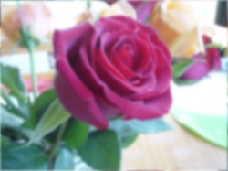
我把这幅画一些美丽的夏日玫瑰在我的厨房。我喜欢柔和的辉光的玫瑰和各种各样的颜色。焦点显然是深红色的玫瑰在中间。
我的目的是创建一个快速油的研究,将传达一个意义上的自发性和新鲜度。我想给观众的印象,但避免过度工作画布,
让我们开始学习如何画玫瑰在一起。
首先,我准备两份主要的图像。在一个,我使用图像处理软件模糊图片。眯眯眼一个主题是一个伟大的方式来发现主要的形状和音调,但是它变得累人。
一个blurredimage允许我做同样的事情没有得到一个头痛。一旦我有绘画封锁在正确,我发现细节不是容易漆或没有必要。

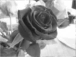
第二个副本是一个灰度版本,这有助于我看看音调我需要组合不同地方。音调是指南针,引导混合的颜色,因为一切都会系在一起的色调关系。如果音调是正确的,这幅画看起来统一。

我使用一个gessoed 6“×8”(15 cm x 20厘米)垫板。我有三个猪鬃榛子刷子(从6号至4)加上一个小整数1刷素描和细节。
我的颜色调色板包含4水溶性油颜色:镉黄介质、镉橙、暗红、深蓝色(加钛白色)。
我限制我的时间为20分钟。我发现我的时间越少,越不可能我是忙得团团转,结果是一个更强的绘画。这是一个技术我学会了从克雷格-尼尔森。
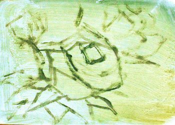
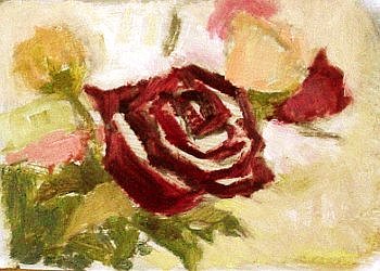
1)首先,使用模糊图像,我的草图组成编辑出细节和较小的形状。即使模糊图像,我斜视所以我可以缩小音调下来几。在早期是很重要的,赶上了“推力”(或“手势”)的玫瑰。现在,我把它们作为汽缸,只有描绘最大的暗“裂缝”,表示事情的发展方向。我不要活在细节。

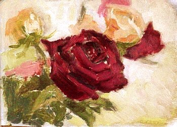
2)一旦草图是满意的,我用笔刷画最大的兴趣中心:大玫瑰在中间。笔法大胆…甚至有点草率。我混群青成暗红的暗色调和调整它通过添加更多的暗红,中间色调。
请注意,这是更重要的阶段学习如何画玫瑰——初始分化的大型群众与正确的颜色的笔记。

3)我继续覆盖了大量不同平的颜色。我还是眯着眼不停的在我迷失在细节。目标仍然是创造近似形状一个印象的玫瑰。

4)回到了大红色的玫瑰,我添加一些充满活力的,浅色调的初始渐黑。我混合一点白色,和镉橙成暗红。我注意到红色添加白色的混合,因为我想避免任何白垩。仍然使用大刷,我粗糙的在完整的帆布

5)一旦平声调,大块都放下,我开始混合色调变化来创造更多的深度。我比较新的音调与之前的保持至关重要的色调平衡。我添加一些最聪明的语气在后台的玫瑰。当你学习如何画玫瑰,记住的基本形状是圆柱形,玫瑰和照明将影响他们因此。在这里,光来自右边。

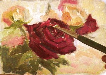
6)使用我最小的刷子添加控制,刷突出在中间的玫瑰。因为玫瑰有一个天鹅绒像哑光表面,突出应该软不是闪亮。

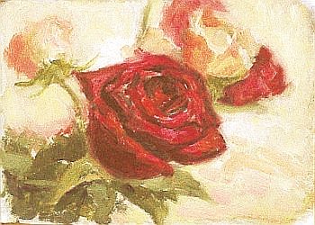
7)最后阶段的画边控制。我想要“软”边退去,锋利边缘自告奋勇。放样的色彩块大刷,正如我前面做的那样,可能会留下很多粗糙的边缘。他们可以是两个形状连接或飞机满足在相同的形状。我使用一个清洁刷(或我的手指)软化边缘的左上角玫瑰和玫瑰在右上角。我也软化最远的花瓣的中间玫瑰保持关注锋利的中心的大玫瑰。软、硬边都有他们的地方在实现强大的视觉冲击。

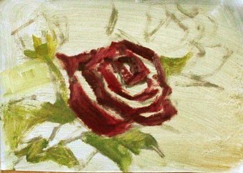
8)我注意,红玫瑰在中间是工作过度的危险。所以我停止。
我经常做这类小型,快速油研究准备更大的绘画。它就像一个测试运行在一个马拉松。当Itackle较大的格式,我已经练习了笔刷并计算组成。它真的抚平过程。
原文如下:
Do you find the thought of learning how to paint roses a bit daunting? All those petals and subtle shades of color! On this page I’ll use a step-by-step oil painting demonstration to show you that the process of how to paint roses is very doable. The same procedure work with acrylics, too.
I took this picture of some roses on a beautiful summer day in my kitchen. I like the soft glow of the roses and the variety of colors. The focal point is obviously the deep red rose in the middle.
My intention here is to create a quick oil study that will convey a sense of spontaneity and freshness. I want to give the viewer an impression, but avoid overworking the canvas,
Let’s started to learn how to paint roses together.
First, I prepare two copies of the main image. In one, I used image processing software to blur the picture. Squinting at a subject is a great way to spot the main shapes and tones, but it gets tiring.
A blurredimage allows me to do the same thing without getting a headache. Once I have the painting blocked in correctly, I find that details are either easier to paint or not necessary.
The second copy is a gray scale version, which helps me see the tones I need to mix for different parts. Tones are a compass that guides the mixing of colors, because everything will be tied together by tonal relationships. If the tones are right, the painting looks unified.
I use a gessoed 6”x 8” (15cm x 20 cm) mat board. I have three bristle filbert brushes (ranging from number 6 to 4) plus a small round number 1 brush for sketching and details.
My color palette consists of 4 water soluble oil colors: cadmium yellow medium, cadmium orange, alizarin crimson, and ultramarine blue (plus titanium white).
I limit my time to 20 minutes. I find that the less time I have, the less likely I am to fuss around, and the result is a stronger painting. It’s a technique I learned from Craig Nelson.
1) First, using the blurred image, I sketch the composition—editing out the details and smaller shapes. Even with the blurred image, I squint so I can narrow the tones down to just a few. It is important early on to catch the “thrust” (or “gesture”) of the roses. For now, I treat them as cylinders, and only depict the largest dark “crevasses” to indicate where things are going. I don’t dwell on the details.
2) Once the sketch is satisfactory, I use the largest brush to paint the center of interest: the large rose in the middle. The strokes are bold…even a bit sloppy. I mix ultramarine blue into alizarin crimson for the dark tone and adjust it by adding more alizarin crimson for middle tones.
Note that this is the more crucial stage of learning how to paint roses – initial differentiation of large masses with the correct color notes.
3) I continue to cover the large masses with different flat colors. I am still squinting to keep me from getting lost in details. The objective is still to create approximate shapes—an impression of the roses.
4) Returning to the large red rose, I add some vibrant, lighter tones over the initial darker tones. I mix a bit of white, and cadmium orange into alizarin crimson. I am careful about adding the white into the red mixture, because I want to avoid any chalkiness. Still using the big brush, I rough in the full canvas
5) Once the flat tones and large masses are laid down, I start to mix tonal variations to create more depth. I compare the new tones with the previous ones to keep the all-important tonal balance. I add some of the brightest tone to the roses in the background. As you learn how to paint roses, remember that the basic shape of a rose is cylindrical, and lighting will affect them accordingly. Here, the light is coming from the right side.
6) Using my smallest brush for added control, I paint the highlight on the middle rose. Because roses have a velvet-like matte surface, the highlight should be soft—not shiny.
7) The final stage of the painting is edge control. I want to make “soft” edges recede and to sharp edges come forward. Laying down blocks of color with the big brush, as I did earlier, is likely to leave a lot of harsh edges. They may be either where two shapes connect or where planes meet within the same shape. I use a clean brush (or my finger) to soften the edges of the top left rose and also the rose at the top right corner. I also soften the furthest petals of the middle rose to keep the focus on the sharp center of the large rose. Soft and hard edges both have their place in achieving strong visual impact.
8 ) I notice that the red rose in the middle is in danger of being overworked. So I stop.
I often do this kind of small, quick oil study to prepare for larger paintings. It is like a trial run before a long marathon. When Itackle the larger format, I have already practiced the brushstrokes and worked out the composition. It really smooths the process.

