

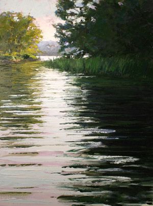
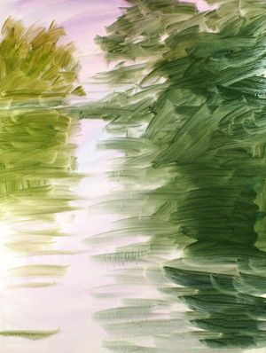
河流弯曲(油板、24×18)由黛博拉·奎因老李
“我的绘画风格是具象与抽象结构强调强烈,对比价值观和大胆的涂料应用程序导致的一幅画都有信心和和平,”奎因老李说黛博拉。继续阅读一个演示如何创建故事板和使用她调色板刀画河湾(上图)。
.
材料
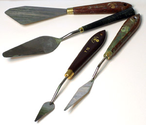
调色板刀我使用楔形和大小不同从大约1到4英寸的长度。有时在绘画过程中我运用油漆在广泛的清洁工用更大的刀和其他时候的细节点或一个较小的刀是必要的。
.
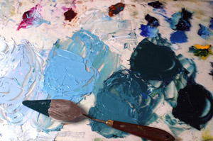
我的调色板是一块玻璃,12×24,放在白色垫板,颜色安排如下:开始在左下角Permalba白,耐晒黄灯,黄赭,深褐色,范戴克布朗,暗红,二氢喹吖啶红、群青、酞青蓝和暗绿色。(我几乎一个干净整洁的画家,有时加一滴油漆的地方如上图黄色。)
前三个混合物显示从左到右是白色的,酞青蓝和二氢喹吖啶红、白、酞青蓝、深蓝色、白色、深蓝色和一点点的深褐色。这两个黑暗的混合物在右边包含略不同数量的深蓝色,酞青蓝和一点要么二氢喹吖啶红或深褐色。
.
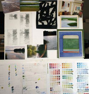
故事板,像我说的,是一个集草图、照片、剪报、颜色图表和无论我发现激发我,会给我线索完成作品。草图和照片是有帮助的对于组成。剪下的一幅画如弗朗茨·克莱恩提醒我要保持自由和大胆的与涂料的应用和理查德·德本肯恩的绘画形象等等,给了我一些颜色参考。
.
过程
一旦成分已经确定,与Gamsol油漆,油漆稀释剂稀释,应用于Gessobord &。值和颜色开始成形在这个阶段。
.
一个靠近的石油在绘画传达的笔法在这个阶段和水滴和运行的油漆,其中一些是可见的在最后一块。
.
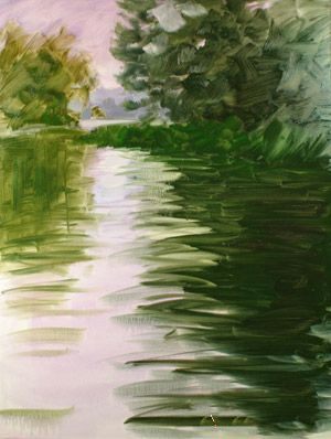
第二个应用程序的稀油油漆完成在绘画。值已经得到增强和颜色继续出现。
.
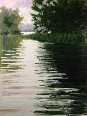
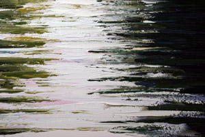
在干在绘画,油画颜料(变薄)是应用于调色刀。许多深浅的绿色混合着暗绿色,深蓝色和范戴克棕色使黑暗的区域在右边。光区域的天空和水是一个混合的白,有点二氢喹吖啶红和酞青蓝。面临的挑战是保持调色刀中风清洁和蓄意为之,黑暗与光明地区混合。
.
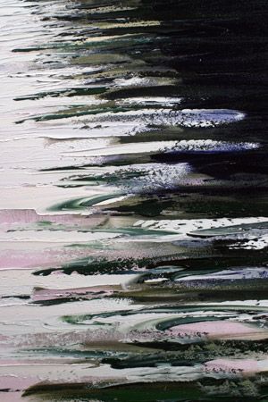
深绿色油漆应用水平中风用调色刀。光紫漆应用在同样的方式。调色板刀擦拭干净后每个冲程的光明与黑暗涂料满足。几个选择螺旋纹是用来提高水的错觉。
.
生黄土和耐晒黄灯被添加到绿色的混合物来创建反射的树木在左边。标志的调色刀保持水平在这一区的幻想出水面。一些油洗可以透过厚厚的油漆由调色刀。
.
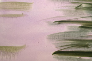
这张特写的图片展示了范围的完成标志着调色刀可以创建,从平地在遥远的水到尖的海草。
原文如下:
Creating a Landscape With a Palette Knife Demonstration
Posted on January 7, 2011 by Deborah Quinn-Munson | Categories: Art Articles: Education & Topics, Art Mediums & Drawing, Landscape Painting: Techniques & Tutorials, Oil Painting Techniques Tips & Instruction, Read The Artist's Magazine, Subject, Top Art Techniques & Tips. Bookmark the permalink.
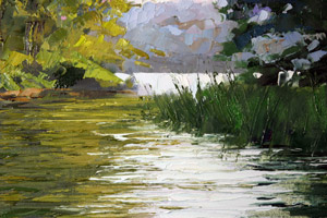
River Bend (oil on board, 24×18) by Deborah Quinn-Munson
“My painting style is representational with emphasis on a strong abstract structure, contrasting values and bold paint application resulting in a painting that’s both confident and peaceful,” says Deborah Quinn-Munson. Keep reading for a demonstration on how she creates a storyboard and uses palette knives to paint River Bend (above).
.
Materials
The palette knives I use are wedge shaped and vary in size from approximately 1 to 4 inches in length. At times in the painting process I am applying paint in broad sweeps with the larger knives and other times the detail of the point or a smaller knife is necessary.
.
My palette is a piece of glass, 12×24, placed over white mat board, with colors arranged as follows: beginning in the lower left corner Permalba White, Hansa yellow light, raw sienna, burnt sienna, Van Dyke Brown, alizarin crimson, quinacridone red, ultramarine blue, phthalo blue and sap green. (I am hardly a neat and tidy painter and sometimes add a drop of paint out of place such as the yellow pictured here.)
The first three mixtures shown from left to right are white, phthalo blue and quinacridone red, white, phthalo blue and ultramarine blue, white, ultramarine blue and a bit of burnt sienna. The two dark mixtures on the right contain slightly different amounts of ultramarine blue, phthalo blue and a touch of either quinacridone red or burnt sienna.
.
The storyboard, as I refer to it, is a collection of sketches, photographs, clippings, color charts and whatever I find that inspires me and will give me clues to the finished piece. Sketches and photos are helpful for composition. Clippings of a painting such as Franz Kline remind me to stay free and bold with paint application and Richard Diebenkorn’s painting image, among others, gives me some color reference.
.
Process
Once the composition has been determined, oil paint, thinned with Gamsol paint thinner, is applied to Ampersand Gessobord. Values and colors begin to take shape at this stage.
.
A close up of the oil under-painting conveys the loose brushwork at this stage and the drips and runs of the paint, some of which will be visible in the final piece.
.
The second application of thin oil paint completes the under-painting. Values have been enhanced and color continues to emerge.
.
Over the dry under-painting, oil paint (not thinned) is applied with a palette knife. Many shades of green mixed with sap green, ultramarine blue and Van Dyke Brown make up the dark area on the right. The light area of sky and water is a mixture of white and a bit of quinacridone red and phthalo blue. The challenge is to keep the palette knife strokes clean and deliberate as the dark and light areas blend.
.
Dark green paint was applied in horizontal strokes with a palette knife. Light violet paint was applied in the same manner. The palette knife is wiped clean after each stroke where the light and dark paint meet. A few choice swirl marks are made to enhance the illusion of water.
.
Raw sienna and Hansa yellow light is added to the green mixture to create the reflection of the trees on the left. Marks of the palette knife are kept horizontal in this area to create the illusion of the water surface. Some of the oil wash can be seen through the thick paint made by the palette knife.
.
The close-up of the completed image illustrates the range of marks the palette knife can create, from flat areas in the distant water to the sharp points of sea grass.


