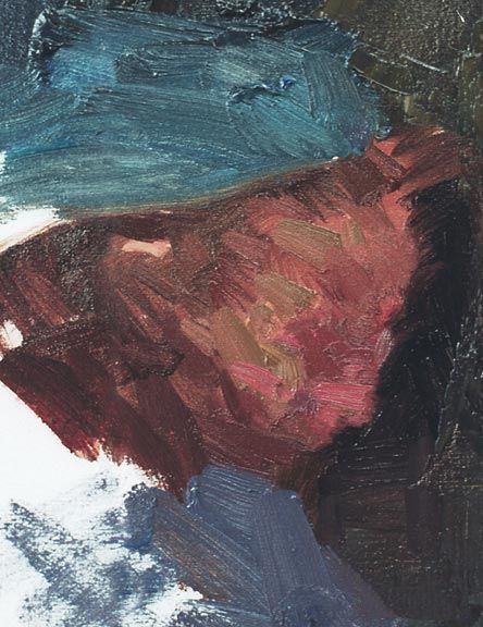
As always, whether I'm working over a drawing or not, from a photo or from life, I start with the large shapes (of the area I'm considering at that time) first. Don't become so tied to your charcoal sketch that you're afraid to obliterate it with your block-in strokes -- you drew it once, you can draw it again as you paint! These large, underlying strokes give the work life and structure. Note also on the side of the face how I let the background and flesh color bleed into each other so that I can work the edges back and forth. Don't paint right up to the line or you'll simply get unnaturally hard edges. When I'm doing demos or Quick Draws, I love the expressions on people's faces when they see the painting at this stage since it looks so utterly un-human that people must be wondering if I'm nuts. The thing is, once you start thinking purely abstractly, there's no difference from this stage and all the rest since I'm always concerned with the abstract shapes rather than wondering if I'm getting a likeness or not. If you get all the shapes right, then it will actually look like the person you're painting, which is the magical part of painting. But this won't happen until the very end, so don't let it creep into your thinking, and don't be bothered by all the raised eyebrows of those watching at the beginning. Only think, "Is this strange little shape in the correct place, value, color, edge, in relation to those other strange shapes that I've already put down?"
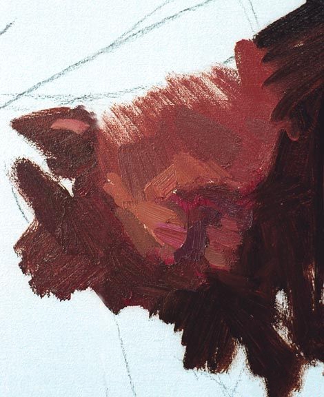
Now I slowly move to progressively smaller shapes. Notice also the layering of warmer flesh tones over cooler ones and vica versa. You can make the painting as colorful or as gray as you want. For this painting I'm going to use a more subtle breakdown of warm and cool. If I wanted to do it more colorfully, I'd merely think of which primary colors I mixed on my palette to make up the flesh tone "browns" and mix them on the canvas instead. The thing to keep in mind is that everything must be in the correct relation to each other. If I were to put in a pure spot of blue on this subject, I would have to balance it with pure yellows and reds as well.
