

但是你需要信任的过程,该方法在这七个步骤。做每一步尽可能诚实和忠实地没有跳过或结合步骤,或添加任何东西。初步草图、测量和绘图不是问你。只做简单的步骤序列,显勇气和信任在每一步。不继续下一步,直到你满意你所拥有的。
方法可用于油和丙烯画,但是厚在薄的原则必须坚持下,你可能需要等待绘画和价值研究干之后再继续。我经常工作在丙烯酸价值研究,然后改变石油。
虽然这个方法似乎很简单和纯洁的,它的工作原理。重点是关于放下什么你看,当你看到它。所以让我们开始吧!
(这篇文章是一个提取从布莱恩·西蒙的书7步骤成功的绘画,并获得允许使用。)
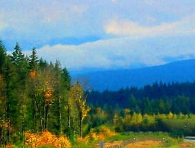
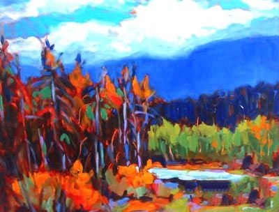
看看这个主题景观(这里)。研究它。忘记名字的事情(如天空,树,云),寻找形状,颜色,设计,和价值。
斜视、斜视和斜视。眯着眼细节有助于消除和减少颜色,这样你就可以看到大图像形状和运动。
看到它已经画在你的头脑中。看到你的主题的形式在两个维度。
不急这一步。四分之三的画都是在这个阶段完成的。
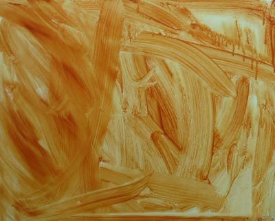
底层色(或爽肤水)消除了严酷的,吓人的白色画布,并允许你自由油漆不担心“填写”的白色。使用一个大刷漆深褐色的洗。
深褐色的原因吗?在我的经验中它能够很好地处理大多数其他颜色,是温暖的颜色。上下文的蓝色和绿色,蓝色黄土可以呈现一个红色的外观。
喜欢画画的感觉,让笔画。不要担心它甚至和混合,保持宽松和自由。不开始塑造你的形象,你只是创建一个彩色背景。有乐趣,获得绘画的热身和心情。
不要让你的油漆,看起来黑了,还是那么瘦,在画布上。简单地覆盖所有画布的方式取悦你,然后停止。

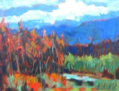
看主题和识别形状,使用深褐色,粗线表示这些。确定五到六形状,但避免细节。
这一步是对组织的构成这幅画在画布上的表面。照片中可以看到,六、七大形状已确定。整个画布应该像拼图。
一旦你这样做,如果油漆还是湿的,用一块抹布,从较轻的地区的涂料油漆。识别最轻的地区,眼睛斜视的话题。如果油漆已经干,别担心,你将有机会在以后处理最轻的地区。
看主题和识别形状,使用深褐色,粗线表示这些。确定五到六形状,但避免细节。
这一步是对组织的构成这幅画在画布上的表面。照片中可以看到,六、七大形状已确定。整个画布应该像拼图。
一旦你这样做,如果油漆还是湿的,用一块抹布,从较轻的地区的涂料油漆。识别最轻的地区,眼睛斜视的话题。如果油漆已经干,别担心,你将有机会在以后处理最轻的地区。
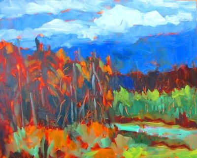
斜眼看你的形象,你看不到颜色(价值与颜色无关,这是光明或黑暗的东西)。从黑暗的偏暗,大致画他们。通过大约五值,从最黑暗最轻。
在这一点上你可以推断出一些表示但绝对没有细节。使用少量的dioxine紫色暗淡无光,黄土暗偏暗。
在这张照片,你可以看到图片已经存在,尽管我还没有添加任何颜色。
如果你得到的值,你有这幅画。无关紧要的东西的价值是什么,只要它是正确的关系价值。
把油漆薄。不要覆盖所有深褐色,让很多的节目。大约估计的颜色,把他们当你看到他们。有节制的使用白色。
先从最黑暗的颜色和较轻的工作。每种颜色你必须相同的值,下面是什么,否则你的画将“崩溃”!
不使用颜色你不喜欢,但是做的颜色你使用“唱”,考虑到旁边的每个颜色的依赖。的关系是重要的,而不是实际的颜色。
照片中可以看到,大部分的颜色是在哪里我看到他们粗暴对待。我开始与最黑暗和最轻的颜色。看看所有的价值研究领域正通过——为什么你想掩盖这一切吗?
你将失去一些戏剧研究的价值和兴奋当你运用你的薄的颜色。在此方法中,这是一个正常发生的画,不要担心!
你遗失了黑暗暗?回去把它们放在。然后看灯。如果他们不是足够轻,开始键使用厚一点油漆。
调整颜色,让他们唱歌。但不要添加细节,推断或建议。不要停留在一个地方,工作整体在画布上。
让油漆涂料——不要强迫它树或花。它本身的美。
照片中你可以看到我黑暗的有些偏暗,然后增加了更多的红色和橙色和亮绿色区域。一些凉爽的绿色被添加到河流和前景。
不完成这幅画,但找到一个好地方停止。抵制诱惑来解决一切。让它打扰人,尤其是你。现在是一个很好的时间与厚漆穿上了一些最轻的地区——轻轻把油漆放在在一个中风没有擦洗。
退后一步,让开,让油漆漆!总是会有更多的事情要做,你做的越多,你越鼻烟的生命的事情,试图解决并完成这一切。
注意:这是一个从加拿大艺术家布莱恩·西蒙的书7步骤成功的绘画,并获得允许使用。布莱恩说,他的书从他多年的教人们各界与丙烯酸涂料。“它代表我的心18车间计划和年轻和年老的巨大乐趣。”
原文如下:
Each of us has been endowed with the ability to create. Some have actualized this ability more than others. Many people I know were discouraged early in life from doing anything artistic and adopted beliefs about themselves that made it impossible in their minds for anything ‘creative’ to come from them. If you’re one of them, you’re in for a real surprise. I am of the conviction that anyone can paint. As far as I am concerned, if you have a pulse, and have enough manual dexterity to sign your name, you can paint.
But you need to trust the process, the method set out in these seven steps. Do each step as honestly and as faithfully as you can without skipping or combining steps, or adding anything. Preliminary sketches, measuring, and drawing are not asked of you. Just do the simple steps in sequence, showing courage and trust at each step. Do not proceed to the next step until you are happy with what you have.
The method can be used for oils and acrylics, but the ‘thick over thin’ principle must be adhered to and you may have to wait for the under painting and value study to dry before proceeding. I often work up to the value study in acrylic and then change to oil.
Though this method of painting may seem quite simple and unsophisticated, it works. The focus is about putting down exactly what you see, as you see it. So let’s get started!
(This article is an extract from Brian Simon’s book 7 Steps to a Successful Painting, and used with permission.)
Look at the subject (here a landscape). Study it. Forget names of things (e.g. sky, tree, cloud) and look for shape, color, design, and value.
Squint, squint and squint again. Squinting helps eliminate detail and reduce color so you can see the big shapes and movement in the image.
See it already painted in your mind. See the forms of your subject in two dimensions.
Do not rush this step. Three-quarters of the painting is done at this stage.
Underpainting (or toning) eliminates the harsh, intimidating white canvas and allows you to paint freely without worry about ‘filling in’ the white. Use a big brush to paint a wash of burnt sienna.
Why burnt sienna? In my experience it works well with most other colors and is a warm color. In a context of blues and greens, blue sienna can take on a red appearance.
Enjoy the feel of the paint and let the brush strokes show. Don’t worry about making it even and blended, keep it loose and free. Do not start shaping your image, you’re simply creating a colored background. Have fun, get warmed up and in the mood for painting.
Don’t make your paint so thick that it looks dark, or so thin that it runs down the canvas. Simply cover all the canvas in a way that pleases you, then stop.
Look at the subject and identify the big shapes then, using burnt sienna, rough in lines denoting these. Identify five to six shapes, but avoid detail.
This step is about organizing the composition of the painting over the surface of the canvas. In the photo you can see that six or seven big shapes have been identified. The whole canvas should look like puzzle pieces.
If, once you’ve done this, the paint is still wet, use a rag to pull off the paint from the lighter areas of the paint. To identify the lightest areas, squint your eyes at the subject. If the paint has already dried, don’t worry, you will have a chance later on to deal with the lightest areas.
Squint at your image so you don’t see color (value has nothing to do with color, it’s how light or dark something is). Start with darkest darks and roughly paint them in. Work through about five values, from the darkest to the lightest.
You can infer some representation at this point but absolutely no detail. Use a tiny bit of dioxine purple to darken sienna for dark darks.
In this photo you can see how the image is already there even though I haven’t added any color.
If you get the values, you’ve got the painting. It doesn’t matter what the value of something is, as long as it is right in relationship to the value next to it.
Keep the paint thin. And don’t cover all burnt sienna, let lots of it show. Roughly estimate the colors and put them down as you see them. Use white sparingly.
Start with darkest colors and work to lighter ones. Each color you put on must be same value as what’s underneath it, otherwise your painting will ‘collapse’!
Don’t use colors you don’t like, but do make the colors you use ‘sing’ by considering the dependency of each on the color next to it. The relationship is what counts, not the actual colors.
In the photo you can see that most of the colours are roughed in where I saw them. I started with the darkest and worked to the lightest color. Look at all the areas where the value study peeks through – why would you want to cover it all up?
You will lose some of the drama and excitement of the value study as you apply your thin colors. This is a normal occurrence in this method of painting, do not worry!
Have you lost your darkest darks? Go back and put them in. Then look at the lights. If they’re not light enough, begin to key them up using a bit thicker paint.
Adjust colors and make them sing. But don't add detail, infer or suggest it. Don’t get stuck in one place, work holistically all over the canvas.
Let the paint be paint – don’t force it to be a tree or a flower. It has beauty in itself.
In the photo you can see I darkened some of the darks, then added more reds and orange and light green to areas. Some cooler greens were added to the river and the foreground.
Do not finish the painting, but find a good place to stop. Resist the temptation to fix everything. Let it bother people, especially you. Now is a good time to put on a few highlights with thick paint in the lightest areas – ever so gently lay the paint on top in one stroke without scrubbing.
Step back, get out of the way, let the paint be paint! There will always be more to do and the more you do, the more you snuff the life out of the thing, trying to fix and finish it all.
Note: This is an extract from Canadian artist Brian Simon’s book 7 Steps to a Successful Painting, and used with permission. Brian says his book evolved from his years of teaching people from all walks of life to paint with acrylics. “It represents the heart of my 18-hour workshop program and is enormous fun for young and old.”


