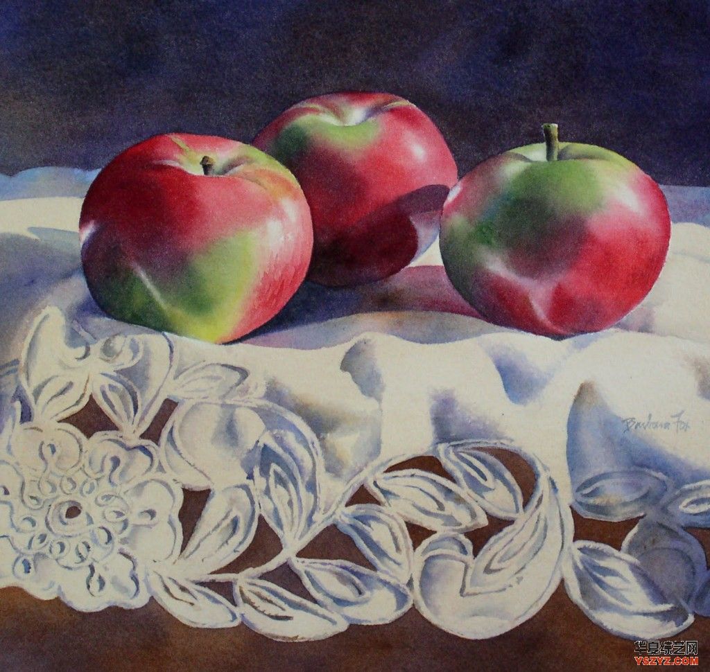
3麦金塔苹果水彩11 * 11 "
这个演示使用大量丰富的层次。
描绘我使用(这些油漆要么是温莎牛顿或m·格雷厄姆品牌油漆):
- Dioxazine紫
- 永久玫瑰
- Napthol红(镉红介质作比较)
- 镉橙
- 暗红
- 暗绿色
- 妓女绿色
- 普鲁士蓝
- 深蓝色
- 钴蓝色
- 烧棕土
- 深褐色
- 生黄土
- 乌贼
纸我使用是杰克Richeson 300 #冷压水彩画纸
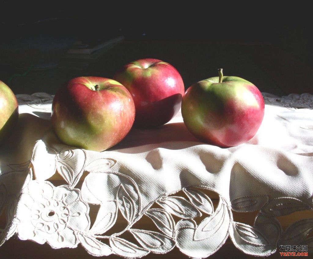
这里是我工作的照片。我通常做一个简单的轮廓图,然后把它吹到尺寸我想漆。
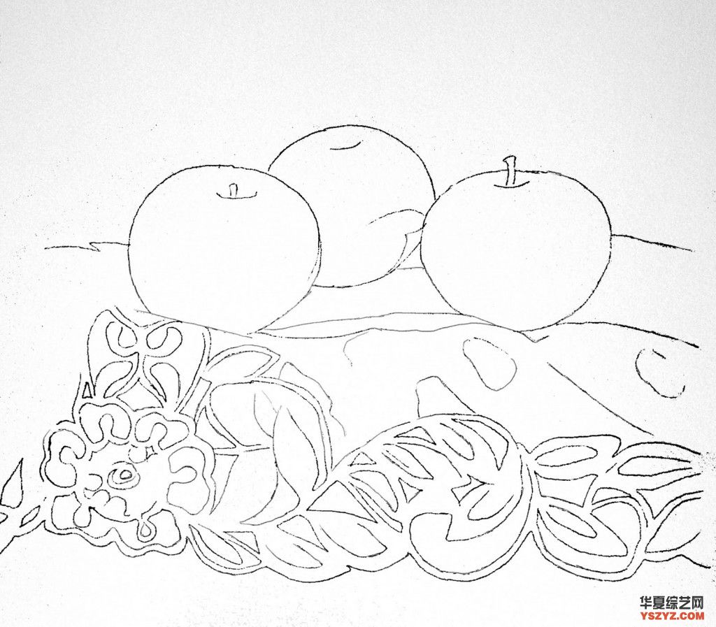
这是图纸。
步骤1。基地层
我的第一层洗我称之为“基地层”。这通常是一个湿在湿洗使用实际的颜色主题,在这种情况下,红色和绿色的苹果(永久玫瑰*,Napthol红色,绿色颜料)。苹果是第一湿与纯净水,然后颜色是应用只需触摸刷到纸。油漆是由水和2色彩搭配漂亮,只有少数人推动的刷。太多的笔法此时会泥泞的颜色。记住,有很多层的颜色来,所以有足够的时间来调整图像。同样,离开白地区很光区和上突出苹果。
一个封闭的一个苹果,步骤1:
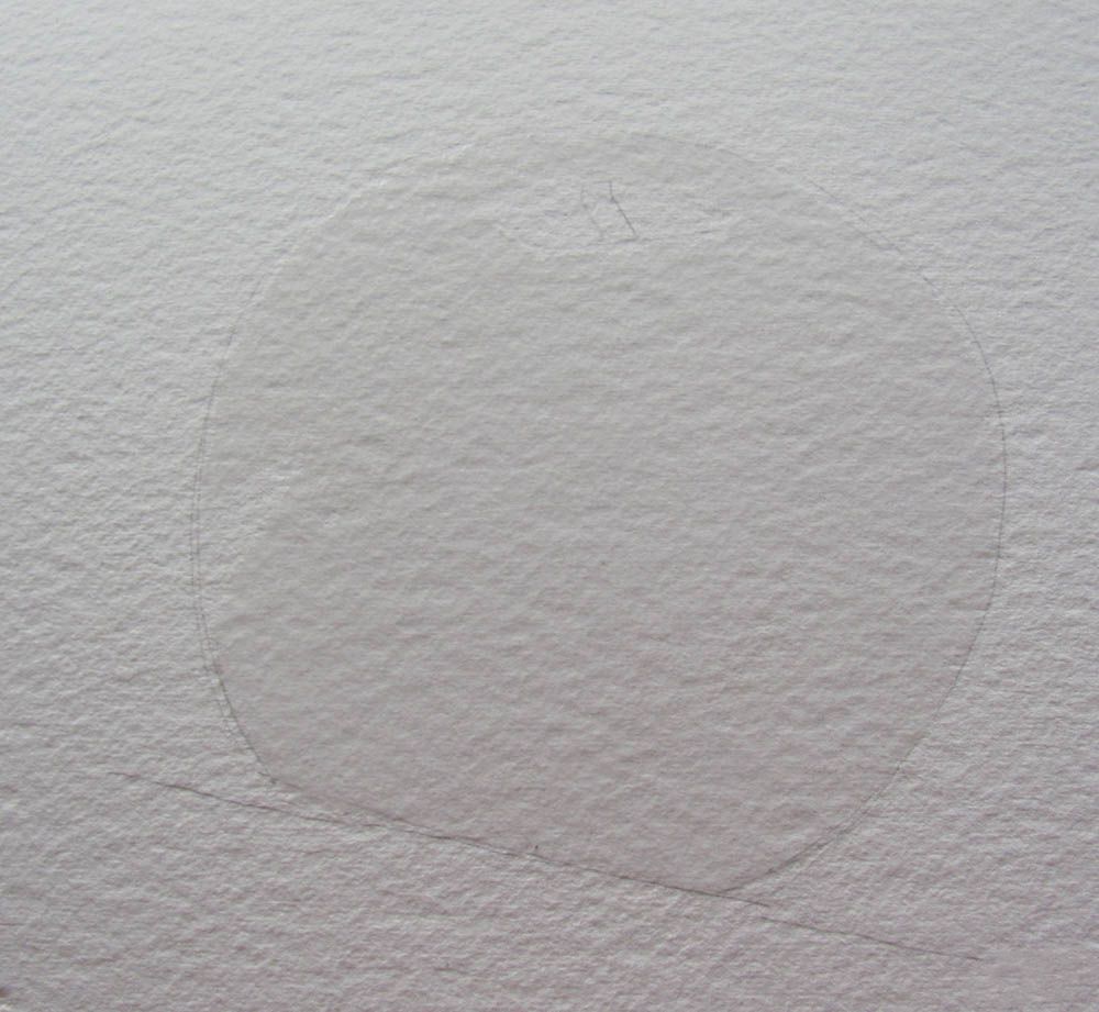
苹果是第一湿与纯水
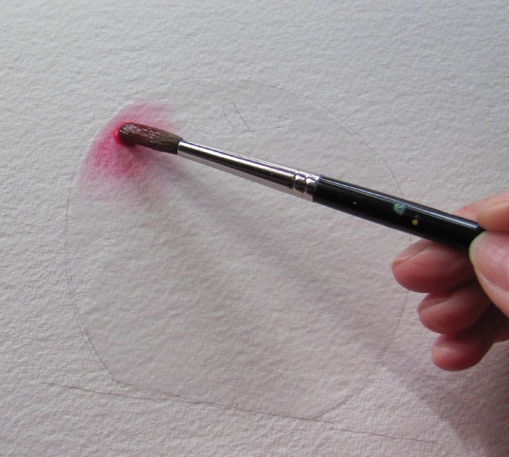
然后颜色是应用只需触摸刷到纸。
离开白地区很光区和上突出苹果。

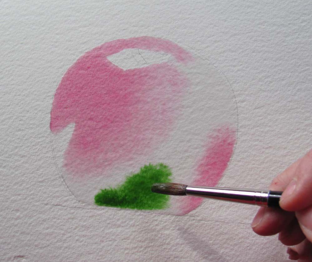

油漆是由水和2色彩搭配漂亮,只有少数人推动的刷。
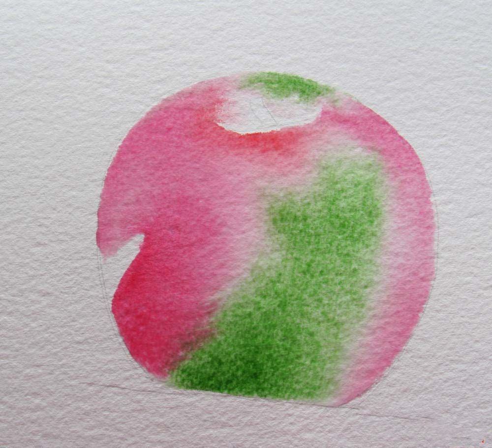
一个额外的位永久性的玫瑰在左下侧,吸去硬边在阀杆。
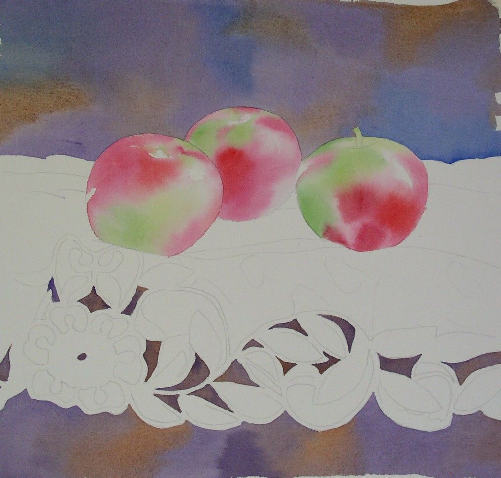
洗下的网状材料是深褐色,Dioxazine紫,和永久的玫瑰,都涌入一个湿洗。再次,注意它们如何组合当添加到湿纸。背景洗是烧棕土,Dioxazine紫色,深蓝色。
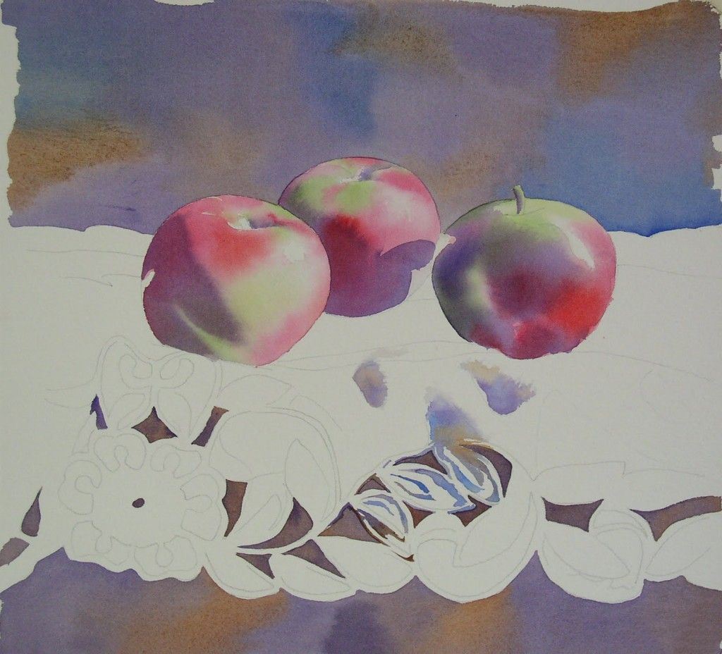
步骤2。阴影(上图)
我用Dioxazine紫画阴影在苹果,留下突出显示的区域。
我开始画阴影和细节在花边使用Dioxazine紫、钴蓝、黄赭。我不把它们,但只是倾斜我的刷到一个不同的颜色,让它们混合自己。它可以看起来有点炫耀的在这一点上,但我知道我将画在他们再次,和阴影最终将黑暗的将统一颜色。
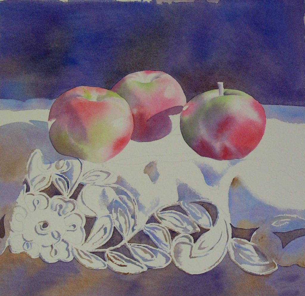
花边的细节和阴影是进展。虽然画的花边是乏味的,我知道渲染它仔细会更好的绘画。
步骤3。第二个层(照片上方和下方)
我画了一层深蓝色的背景,和一层烧棕土下面的花边。你可以看到我有几个洞来填写花边。我画一层绿(绿色颜料)和红色(这次暗红)在苹果。
对于层# 2在苹果,我湿了整个苹果和水,然后洪水在颜色* *。记得离开凸显。
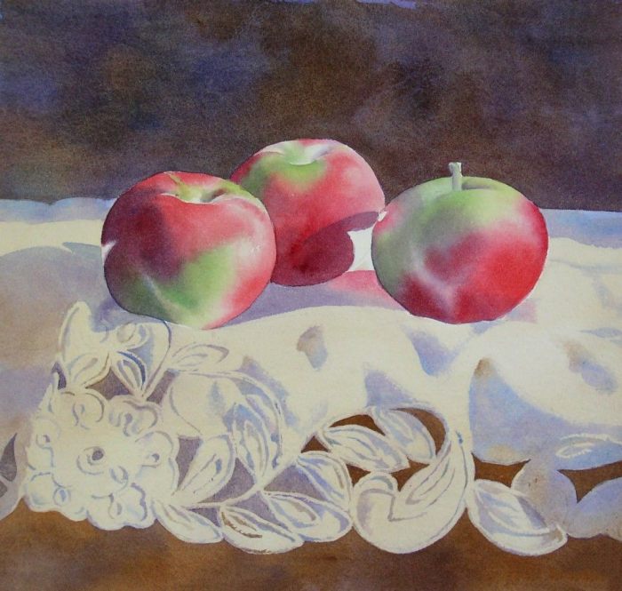
我画一个非常光层生黄土在整个花边面积。这有助于统一颜色,我用于阴影,使材料从过于显眼的白色,和瞩目。
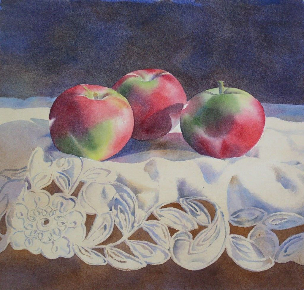
步骤4。值调整(上图)
这幅画需要更深的阴影,我想苹果有丰富的颜色。我画的苹果的阴影使用Dioxazine紫色红色区域和普鲁士蓝在绿色区域。我画一个小钴蓝色的突出在中间的苹果,有一点点的镉橙右上角的第一个苹果。
我加深一些部分如果的褶皱花边,花边细节工作多一点。

步骤5。细节(上图)
一层暗红和暗绿色的苹果,一个小妓女绿色的冷却器绿色区域。
我用Dioxazine紫罗兰和乌贼在茎的苹果。我加深阴影使用Dioxazine之间的苹果紫罗兰和深蓝色,有点暗红。
更多的细节工作的花边,一层Dioxazine紫在花边和背景。* * *
最后一步是让真正黑暗地区深(茎,和阴影就在苹果),减轻一些亮点。我擦掉一些较轻的地区在茎,高光和反射灯与小,硬刷和大量的水。
*当画一个红色的问题时,我通常会先使用永久性的玫瑰。这是一个丰富而温暖的粉红色,看起来比一个轻洗的暗红。我用大红的黑暗,强烈的红色,但是看起来很淡的版本给我。
* *不水洗掉颜色下面?不,不是只要你不刷的太多了。干燥的油漆将留在原地在很大程度上,除非它是不安与大量的刷牙。水,好,刷,坏。
* * *为什么这么多Dioxazine紫? ? ?不知道为什么,但我爱它。这是一个可爱的紫色,但也完美的中性。它似乎工作好作为一个阴影颜色在任何其他颜色,似乎凉爽当一个颜色需要冷却,或温暖当一个颜色需要温暖。注意,我几乎从来没有把它和另一个颜色,但是使用它作为一个在另一个颜色洗。
原文如下:
This demonstration uses lots of richly colored layers.
Paints I used (These paints are either Winsor Newton or M. Graham brand paints):
Dioxazine Violet
Permanent Rose
Napthol Red (Cadmium Red medium is comparable)
Cadmium Orange
Alizarin Crimson
Sap Green
Hookers Green
Prussian Blue
Ultramarine Blue
Cobalt Blue
Burnt Umber
Burnt Sienna
Raw Sienna
Sepia
Paper I use is Jack Richeson 300 # cold press watercolor paper
Here is the photograph I worked from. I generally do a simple outline drawing, then blow it up to the size I want to paint.
Here is the drawing.
Step 1. Base Layer
My first layer of wash I call the “Base Layer”. This is generally a wet on wet wash using the actual colors of the subject, in this case, red and green for the apples (Permanent Rose*, Napthol Red, and Sap Green). The apples were first wet with pure water, then the colors were applied by just touching the brush to the paper. The paint is carried by the water, and the 2 colors mix beautifully, with just a few nudges of the brush. Too much brushwork at this point would muddy the colors. Remember, there are lots of layers of color to come, so there is plenty of time to tweak the image. Also, leave white areas for the very light areas and highlights on the apple.
A close up of one apple, Step 1:
The apples were first wet with pure water
Then the colors were applied by just touching the brush to the paper.
Leave white areas for the very light areas and highlights on the apple.
The paint is carried by the water, and the 2 colors mix beautifully, with just a few nudges of the brush.
An extra bit of Permanent Rose on the lower left side, and blotting the hard edge around the stem.
The wash under the lace material is Burnt Sienna, Dioxazine Violet, and Permanent Rose, all flooded into a wet wash. Again, notice how well they mix when added to the wet paper. The background wash is Burnt Umber, Dioxazine Violet, and Ultramarine Blue.
Step 2. Shadows (photo above)
I use Dioxazine Violet to paint the shadows on the apples, leaving the highlighted areas.
I begin painting the shadows and the detail on the lace using Dioxazine Violet, Cobalt Blue, and Raw Sienna. I don’t mix them, but just dip my brush into a different color from time to time, and let them mix themselves. It can look a little garish at this point, but I know I will be painting over them again , and the shadows will eventually be darkened which will unify the colors.
The lace detail and shadow is coming along. Although painting the lace is tedious, I know that rendering it carefully will make a better painting.
Step 3. Second Layer (photos above and below)
I painted a layer of Ultramarine Blue in the background, and a layer of Burnt Umber below the lace. You can see where I have a few more holes to fill in the lace. I painted another layer of green (Sap Green) and red (this time Alizarin Crimson) on the apples.
For Layer #2 on the apples, I wet the entire apple with water, then flood in the colors**. Remember to leave the highlights.
I painted a very light layer of Raw Sienna over the entire lace area. This helps unify the colors that I used for the shadows, and keeps the material from being too glaringly white, and attention grabbing.
Step 4. Value adjusting (photo above)
The painting needs deeper shadows, and I would like the apples to have richer colors. I paint over the apple’s shadows using Dioxazine Purple in the red areas, and Prussian Blue in the green areas. I paint a little Cobalt Blue on the highlight on the middle apple, and a wee bit of Cadmium Orange on the top right of the first apple.
I deepen some parts if the folds in the lace, and work on the lace detail a little more.
Step 5. Details (photo above)
Another layer of Alizarin Crimson and Sap Green on the apple, this time with a little Hookers Green for the cooler green areas.
I use Dioxazine Violet and Sepia on the stems of the apple. I deepen the shadows between the apples using Dioxazine Violet and Ultramarine Blue, with a little Alizarin Crimson.
More detail work on the lace, and another layer of Dioxazine Violet under the lace AND in the background.***
The final step is making really dark areas darker (the stems, and shadows right under the apples), and lightening some highlights. I scrub out some lighter areas around the stems, and the highlights and reflected lights with a small, stiff brush and plenty of water.
* when painting a red subject, I usually start with Permanent Rose. It is a rich and warm pink, and looks better then a lighter wash of Alizarin Crimson. I use Alizarin Crimson for dark, intense reds, but a washy version looks dull to me.
** Doesn’t the water wash out the color underneath? No, not as long as you aren’t brushing it too much. The dry paint will stay put for the most part, unless it is disturbed with a lot of brushing. Water, good, Brush, bad.
*** Why so much Dioxazine Violet??? Not quite sure why, but I love it. It is a lovely purple, but also the perfect neutral. It seems to work great as a shadow color on any other color, and seems to cool when a color needs to be cooled, or warm when a color needs to be warmed. Take note, that I almost never mix it with another color, but use it as a wash over another color.


